The Functional Shift: From Static Art to Mobile Communication
The core of this typographic revolution lies in the fundamental difference between static and mobile viewing environments. When a branded vehicle is parked, viewers have the luxury of time to examine intricate details, artistic flourishes, and secondary text. However, once the vehicle is in motion, the visual dynamics change entirely. A car or truck traveling at highway speeds or moving through a busy intersection offers a viewing window of approximately 2.5 to 3 seconds. In this brief interval, the human brain must identify the brand, understand the service provided, and ideally, register a call to action.
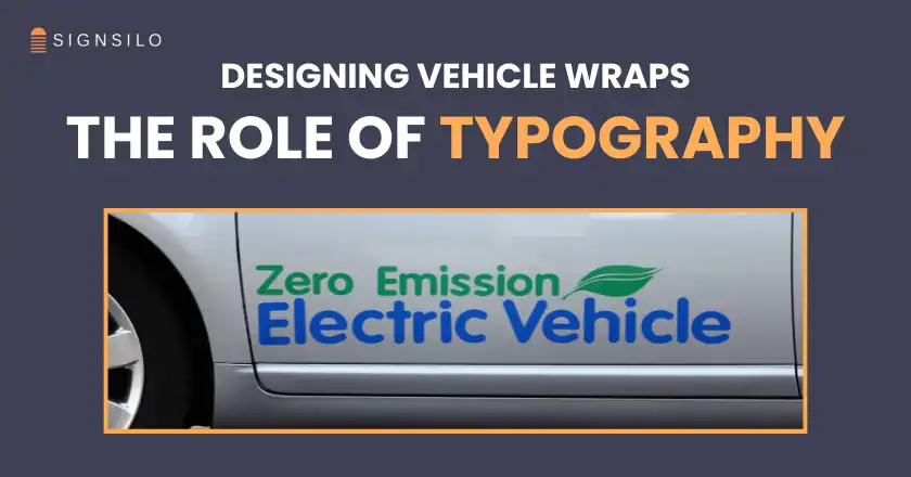
Professional fleet designers are increasingly recognizing that elaborate scripts and decorative typefaces, while aesthetically pleasing in a portfolio, often fail the "road test." Fine strokes tend to disappear at a distance, and tightly spaced characters blur together when moving. This has led to a standardized preference for bold, clean sans-serif typefaces that provide high contrast against the vehicle’s background. By prioritizing legibility over ornamentation, designers are ensuring that the vehicle fulfills its primary role: acting as a mobile billboard that delivers a clear, unambiguous message.
A Chronology of Vehicle Branding Evolution
To understand the current dominance of typography, it is necessary to examine the historical trajectory of vehicle graphics. The industry has passed through several distinct phases:
- The Hand-Painted Era (1900s–1980s): For decades, vehicle branding was the domain of master sign painters. Typography was inherently central to this era because painting complex images was time-consuming and expensive. Branding was often limited to the company name and a phone number on the door panels.
- The Vinyl Revolution (1990s–2000s): The advent of computer-aided design (CAD) and vinyl cutting plotters allowed for more precise lettering. However, the real change came with the introduction of large-format digital printing. Suddenly, it was possible to "wrap" an entire vehicle in a photographic image.
- The Era of Complexity (2005–2015): With the technical barriers removed, many designs became overly complex. Fleets were often covered in "visual noise," including flames, lightning bolts, 3D effects, and multiple layers of overlapping text. This period often prioritized the "wow factor" of the wrap technology over the actual communication of the brand.
- The Typographic Renaissance (2016–Present): Modern design has circled back to the realization that "less is more." Influenced by digital user interface (UI) design and the need for cross-platform brand consistency, fleet graphics have become cleaner. Typography has reclaimed its spot as the "star" because it is the most efficient carrier of information.
Supporting Data: The Economics of Legibility
The shift toward typographic-centric design is supported by data from the Outdoor Advertising Association of America (OAAA) and various marketing research firms. According to industry statistics, a single intra-city vehicle wrap can generate between 30,000 and 70,000 impressions daily. Furthermore, mobile advertising has a 97% recall rate, making it one of the most effective forms of out-of-home (OOH) media.
However, recall is directly tied to legibility. Research into "glance legibility" suggests that for every 10 feet of viewing distance, the height of the lettering should increase by at least one inch. For a vehicle to be readable from 100 feet away—a common distance in traffic—the primary typography must be at least 10 inches tall. When designers use complex, thin, or script-heavy fonts, they effectively reduce the "readable range" of the vehicle, wasting potential impressions and lowering the return on investment (ROI) for the business owner.

The Role of Professional Resources and Testing
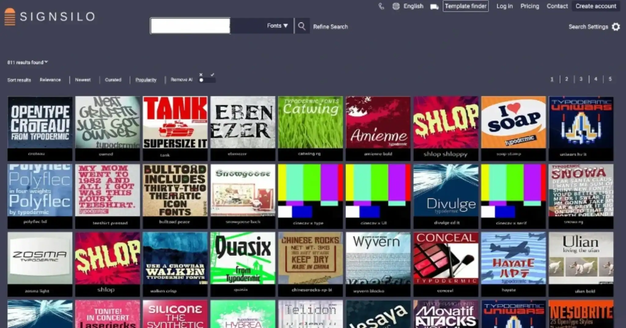
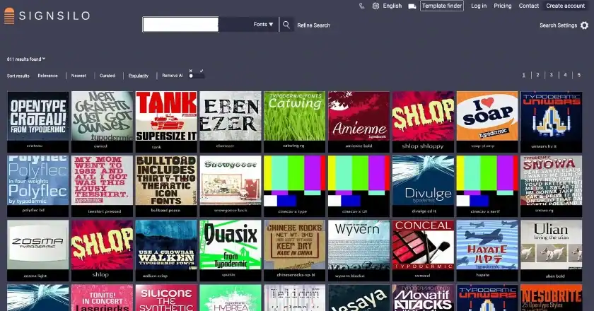
The complexity of designing for a three-dimensional, moving object has necessitated more sophisticated tools for designers. Platforms like SignSilo have become essential in this new landscape, providing curated libraries of professional fonts specifically selected for their performance in signage and vehicle applications. Unlike standard web fonts, these typefaces are evaluated for their weight, kerning (the space between characters), and how they maintain their integrity when scaled to massive proportions.
A critical component of the modern workflow is the use of font tester files. These allow designers to create mockups that simulate how a typeface will wrap around the complex curves, rivets, and door handles of a specific vehicle model. A font that appears balanced on a flat computer monitor may become distorted when applied to the flared wheel well of a van or the corrugated side of a box truck. By testing these variables before the vinyl is printed, professionals avoid costly errors and ensure that the typography remains the focal point regardless of the vehicle’s geometry.
Industry Statements and Expert Analysis
Industry experts suggest that the move toward bold typography is also a response to the "visual clutter" of the modern urban environment. "We are bombarded with thousands of marketing messages every day," says one senior fleet consultant. "A vehicle wrap that tries to say too much ends up saying nothing at all. The most successful fleets we see today are the ones that use one or two powerful fonts and plenty of negative space. It projects confidence."
Marketing analysts also point out that typography-heavy designs are more adaptable across diverse fleets. A large corporation may operate everything from small electric sedans to massive semi-trailers. While a complex wrap design might look good on a large truck, it often becomes cramped and unreadable on a smaller vehicle. Typography-led branding systems are inherently "responsive," allowing the core message to be scaled up or down without losing its identity or impact.
Broader Impact and Strategic Implications
The implications of this typographic focus extend beyond mere aesthetics. There is a strategic advantage to simplicity:
- Brand Authority: Clean, well-spaced typography is often associated with established, professional brands. It conveys a sense of reliability and transparency.
- Safety and Compliance: Vehicles with clear, legible identification are easier for customers to recognize, which is particularly important for home-service industries (plumbing, electrical, delivery) where security and trust are paramount.
- Cost Efficiency: While a full photographic wrap is expensive to design, print, and install, typography-focused "partial wraps" or "lettering-only" designs are more cost-effective. They require less ink and less time for installation, while often delivering a higher rate of message retention.
Designing for the Future of Movement
As the automotive industry moves toward autonomous vehicles and more streamlined electric vehicle (EV) designs, the canvas for vehicle graphics is changing. EVs often have smoother surfaces with fewer grills and vents, providing a "cleaner" slate for typographic placement. However, the speed of modern life continues to increase, meaning the "three-second rule" for visibility is more relevant than ever.

The future of fleet design will likely see an even greater integration of typography and brand identity. We are seeing a move toward "custom corporate typefaces" designed specifically for a company’s fleet, ensuring that the very shape of the letters becomes a recognizable brand asset. This holistic approach treats the vehicle not just as a piece of equipment with a logo on it, but as a primary touchpoint in the customer journey.
For the modern fleet designer, the challenge is no longer about how much visual information can be squeezed onto a vehicle’s surface. Instead, the question is: "What is the single most important thing the viewer needs to know, and how can we use typography to make that message unmissable?" By answering this question with clean, purposeful, and tested lettering, the industry is setting a new standard for mobile communication where typography is, quite literally, the star of the road.