The modern landscape of outdoor advertising has undergone a significant transformation, shifting from static billboards to a dynamic, mobile-first approach where every commercial vehicle serves as a moving brand ambassador. In this high-velocity environment, the traditional emphasis on complex illustrations and neon-bright color schemes is being superseded by a more fundamental element of graphic design: typography. For decades, vehicle wraps were treated as rolling canvases for artistic expression, often prioritizing aesthetic flair over functional communication. However, as the density of urban traffic increases and the attention span of consumers diminishes, professional fleet designers are recognizing that the success of a vehicle wrap is no longer measured by its visual complexity, but by the speed at which its message can be decoded by a viewer in motion.
The Functional Shift in Mobile Communication Design
The fundamental challenge of vehicle wrap design lies in the distinction between a parked vehicle and one traveling at highway speeds. When a branded van is stationary at a curbside, a viewer has the luxury of time to appreciate intricate scripts, fine-print service lists, and decorative flourishes. On the road, however, the window of opportunity for brand engagement narrows to approximately 2.5 to 3 seconds. This "three-second rule" has forced a paradigm shift in the industry, moving away from decorative "art" toward "communication design."
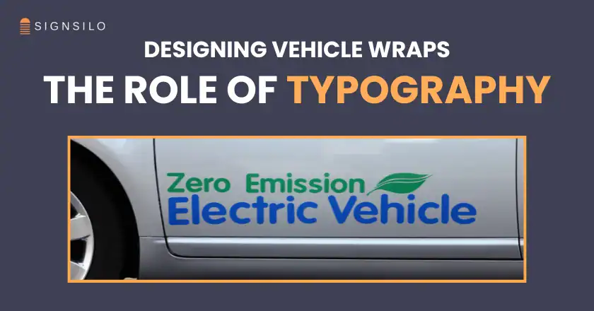
Industry experts note that the human brain processes visual information much faster when it is presented in a structured, legible format. Consequently, clean, high-contrast typography has emerged as the most critical component of a successful wrap. A design that fails to communicate the brand name and the primary service within those few seconds is considered a failure, regardless of how visually stunning the background graphics might be. This realization has led to the elevation of typography from a secondary detail to the central protagonist of the design process.
The Evolution of Vehicle Branding: A Brief Chronology
To understand why typography has taken center stage, one must look at the evolution of vehicle marking technology over the last half-century.
- The Hand-Painted Era (Pre-1980s): Before the advent of vinyl, vehicle branding was the domain of sign painters. Typography was inherently central because hand-lettering was the primary method of identification. However, the complexity was limited by the cost and time required for manual labor.
- The Cut-Vinyl Revolution (1980s–1990s): The introduction of plotters and solid-color vinyl allowed for sharper lines and more durable lettering. During this period, designs were often minimalist out of necessity, focusing on the company name and phone number.
- The Digital Printing Boom (2000s–2010s): The arrival of large-format digital printers changed everything. Suddenly, designers could wrap entire vehicles in high-resolution photographs and complex gradients. This led to an era of "visual clutter," where many wraps became so over-designed that the actual brand message was lost in a sea of imagery.
- The Era of Strategic Typography (2020s–Present): Today, the industry is seeing a "correction." Designers are returning to the principles of classic typography but applying them with modern digital tools. The focus is now on visual hierarchy, legibility at a distance, and brand personality expressed through font choice.
Data-Driven Design: Why Legibility Equals ROI
The shift toward typographic-centric design is supported by significant market data. According to the Outdoor Advertising Association of America (OAAA), vehicle wraps are among the most cost-effective forms of advertising, with a single vehicle capable of generating between 30,000 and 70,000 impressions per day in a major metropolitan area. Furthermore, a study by the American Trucking Association (ATA) revealed that 91% of people noticed the words and graphics on fleet vehicles, and 98% of consumers felt that these graphics projected a professional image for the company.

However, these impressions only translate into brand recall if the text is readable. Research into "glance legibility"—the ability to read text during a brief eye movement—shows that sans-serif fonts with generous x-heights (the height of lowercase letters) are processed up to 20% faster than ornate serif or script fonts. For a business owner, this 20% difference in processing speed can be the difference between a new lead and a missed opportunity.
The Role of Professional Tools: The SignSilo Advantage
As typography has become more technical, the tools used by designers have had to evolve. One of the most significant hurdles in fleet branding is ensuring that a typeface that looks good on a 27-inch monitor will also perform when scaled to six feet long on the side of a box truck. This is where specialized resources like SignSilo have become indispensable to the industry.
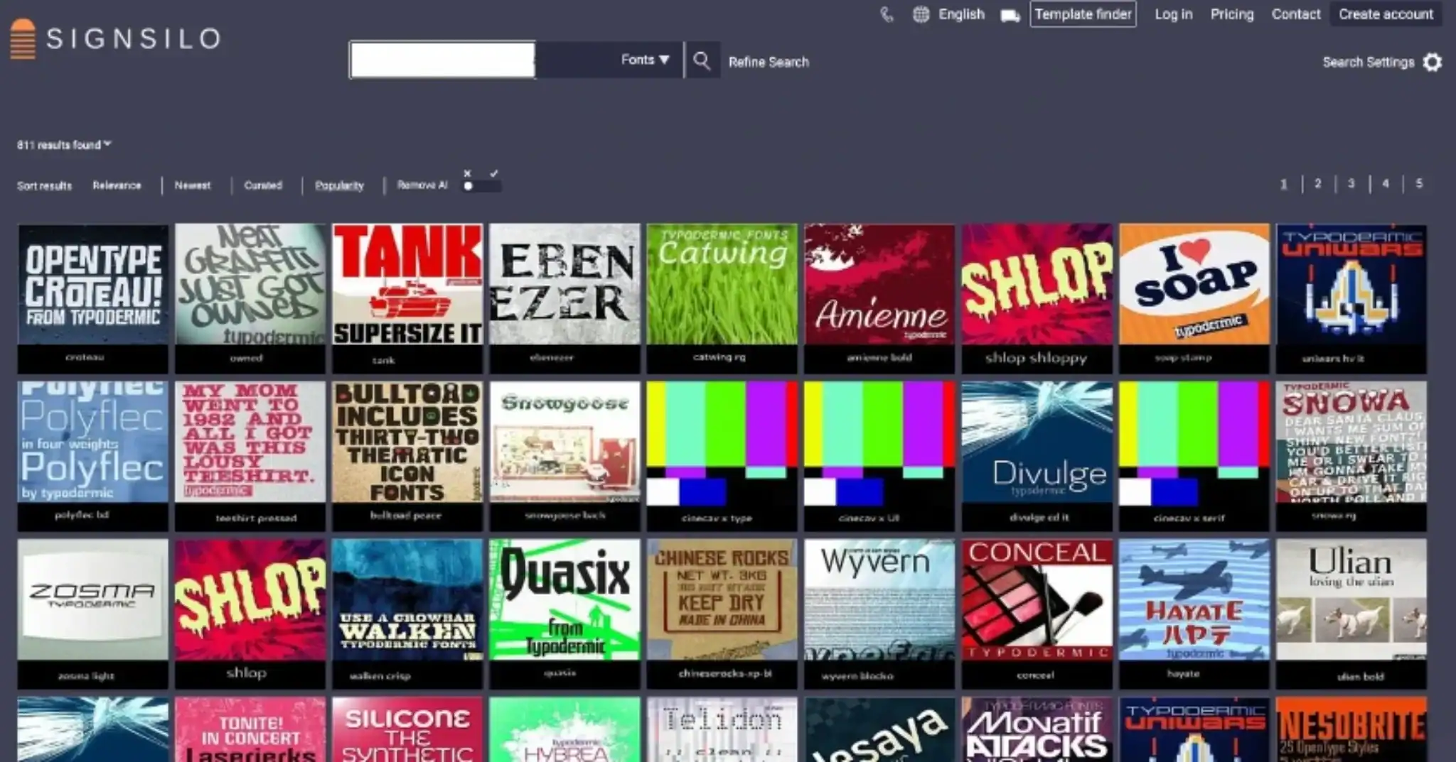
SignSilo provides a curated library of professional fonts specifically vetted for the unique demands of sign making and vehicle wraps. Unlike standard system fonts, these typefaces are designed with "highway legibility" in mind—featuring optimized kerning (the space between letters) and stroke weights that do not "bloom" or blur when viewed from a distance under bright sunlight.
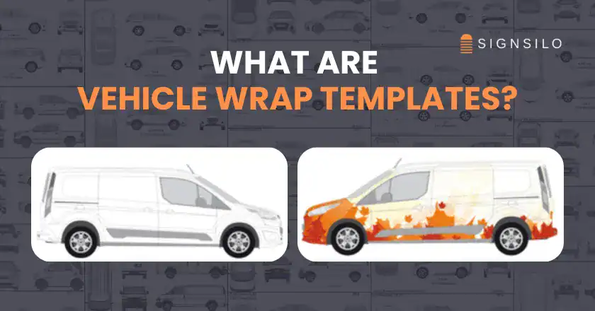
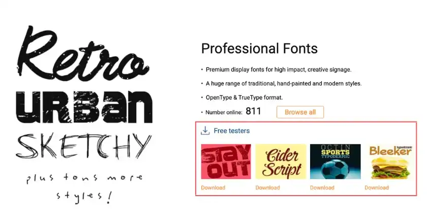
Furthermore, the introduction of font tester files has revolutionized the proofing stage. Designers can now apply specific typefaces to 3D vehicle templates to see how the letterforms wrap around complex curves, door handles, and body moldings. This prevents the common "distortion trap," where a font looks perfect in a 2D layout but becomes unreadable when stretched over the wheel well of a van. By testing these variables before the vinyl is printed, professionals can ensure that the typography maintains its integrity across the entire fleet.
Strategic Branding Through Typographic Personality
Beyond mere legibility, typography serves as a visual shorthand for a brand’s identity. In an era where many businesses offer similar services, the "voice" of the typeface can provide a competitive edge.
- Authority and Reliability: Heavy, bold sans-serif fonts (like Impact or Helvetica Bold) are frequently used by construction and logistics firms to convey strength and stability.
- Innovation and Modernity: Wide-tracked, geometric sans-serifs are the go-to for tech-startups and modern service providers, signaling a forward-thinking approach.
- Approachability: Rounded typefaces or high-quality, legible scripts are used by boutique brands or home-service companies (like florists or pet groomers) to appear friendly and personal.
Professional designers now treat the selection of a font as a strategic business decision. They must balance the "character" of the font with its "functional performance." If a font is too unique, it may be hard to read; if it is too generic, the brand may fail to stand out in traffic.

Industry Reactions and Expert Perspectives
The move toward typographic dominance has been met with widespread approval from sign-making veterans. "We are seeing a return to the fundamentals," says Marcus Thorne, a veteran fleet graphics consultant. "For a while, we were so excited that we could print anything that we forgot what we should print. Now, my clients aren’t asking for more flames or more photos; they’re asking for their phone number to be visible from two blocks away."
Business owners are also seeing the benefits of this "less is more" approach. Simplified, type-heavy designs are often easier and cheaper to repair if a vehicle is involved in a minor collision. Replacing a single door panel with a clean typographic layout is significantly more efficient than trying to color-match a complex, multi-layered photographic wrap.
Broader Implications for the Future of Fleet Design
Looking ahead, the role of typography in vehicle wraps is expected to become even more sophisticated with the integration of new technologies. Reflective vinyls that enhance typographic visibility at night are becoming standard for 24-hour service fleets. Additionally, as autonomous vehicles and "smart cities" evolve, the way vehicles communicate with their environment—and with pedestrians—will rely even more heavily on clear, standardized typographic systems.
The trend toward minimalism in digital UI/UX design is also bleeding into the physical world. Just as websites are becoming cleaner and more text-focused to improve mobile user experience, vehicle wraps are becoming cleaner to improve the "mobile viewer experience." The vehicle is the hardware, the wrap is the interface, and the typography is the content.
Conclusion: The New Standard of Excellence
Why Typography Has Become the Real Star of Vehicle Wrap Design is a question answered by the intersection of psychology, technology, and economics. In the high-stakes environment of mobile advertising, clarity is the ultimate currency. By prioritizing typography, designers are ensuring that their clients’ messages are not just seen, but understood and remembered.
The most effective fleet designs of the next decade will likely be those that embrace restraint. By utilizing professional resources like SignSilo to select and test the perfect typefaces, and by focusing on the core principles of legibility and hierarchy, the vehicle wrap industry is setting a new standard for how brands move through the world. The era of the "rolling billboard" has matured into the era of the "rolling brand identity," where every letter, space, and stroke is engineered for maximum impact on the open road.