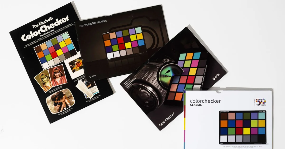
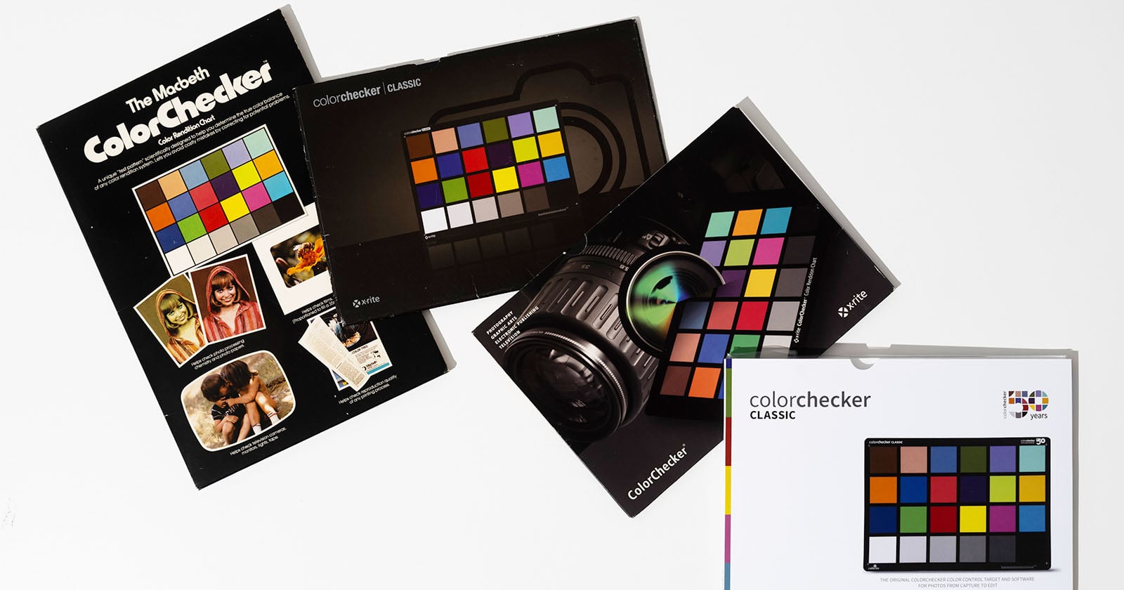
For half a century, the Calibrite ColorChecker has stood as an unwavering sentinel of chromatic truth, empowering photographers, filmmakers, and scientists worldwide to capture and reproduce color with unparalleled precision. Its iconic 24 squares have transcended mere utility, becoming a ubiquitous symbol of color fidelity, from the intimate confines of family albums to the grand stages of magazine covers, towering billboards, and revered museum exhibitions. This milestone marks not just 50 years of a product, but 50 years of shaping visual communication by answering one of the most fundamental and challenging questions in image creation: "What color is this, really?"
The Genesis of a Standard: Addressing Analog’s Chromatic Challenges
Before the advent of the ColorChecker, photographers grappled with a chaotic landscape of color inconsistencies. The analog era was defined by myriad variables: the spectral response curves of different film stocks, the chemical nuances of various processing labs, the unpredictable shifts in ambient and artificial lighting, and the inherent subjectivity of human color perception. Achieving consistent, accurate color across a series of photographs, let alone between different projects or studios, was an arduous, often frustrating, and imprecise endeavor. This environment underscored a profound need for an objective, standardized reference.
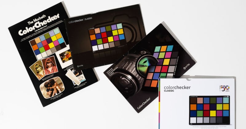
It was against this backdrop that, in the summer of 1976, three visionary scientists at Macbeth – then a division of Kollmorgen, a company renowned for its expertise in color measurement – penned a groundbreaking paper titled "A Color-Rendition Chart." Dr. Calvin McCamy, working alongside H. Marcus and J. G. Davidson, articulated a solution that would fundamentally alter the trajectory of color management. Their invention, initially conceived as a scientific tool, was designed to encapsulate a "known truth inside a frame," providing a quantifiable benchmark for color reproduction.
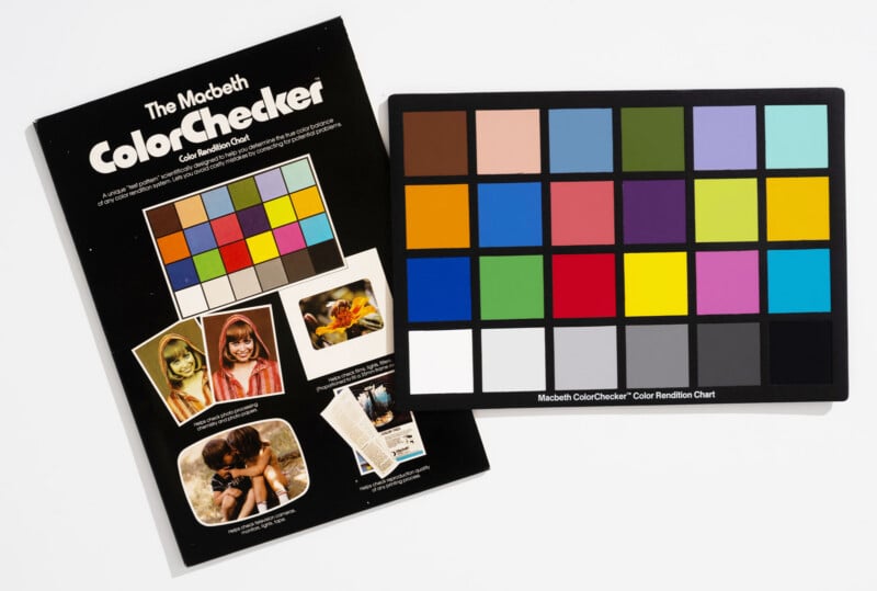
The core innovation lay in the meticulous design of each of the chart’s patches. Unlike simple color swatches, these patches were engineered to exhibit specific, predictable spectral reflectance properties, mimicking the way real-world objects, including the complex array of human skin tones, react and shift under varying light conditions. This ingenious design meant the chart acted as a "colorful body double" that interacted with photographic film and later, digital sensors, in a manner analogous to reality itself. The original chart, measuring 13 by 9 inches, was proportioned to align with a 35mm film frame, making it immediately practical for the prevailing photographic medium of the time.
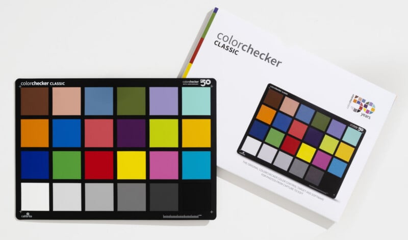
McCamy, Marcus, and Davidson’s foundational text clearly articulated their purpose: "Photography, color printing, and television do not truly reproduce all colors. The nature of the rendition may be described in terms of the ways in which the colors in the image differ from those of the object. The image and object may be compared visually or by measurements. To facilitate comparisons of this kind, we have developed and are making available a well-characterized color chart to be used as a standard test object." This declaration heralded the birth of an indispensable standard.
While the chart’s vibrant chromatic patches – encompassing a spectrum of reds, greens, blues, yellows, oranges, purples, and blues, alongside carefully replicated skin tones – were visually striking, photographers soon discovered the profound utility of its bottom row: the six shades of gray. These neutral gray steps provided a critical reference for establishing accurate exposure and white balance, forming the bedrock for subsequent color adjustments.

The foresight of its creators extended to anticipating a wide array of applications. In 1976, long before the digital photography revolution was a glimmer in anyone’s eye, Dr. McCamy and his team envisioned their chart being "frequently used" for rigorous testing of film types, monitoring spectral response changes over time, analyzing lens characteristics, evaluating the impact of diverse lighting conditions and studio wall colors, and assessing the influence of exposure time on color rendition. Critically, they also possessed the wisdom to acknowledge that while their chart provided an invaluable objective "ground truth," the ultimate aesthetic judgment of a photograph’s color rendition would always rest with the human eye. "The chart is a useful analytical tool, but final judgments should always be based on actual use of processes," they concluded, emphasizing that "the ultimate objective is satisfactory results."
The ColorChecker in the Digital Age: An Enduring Baseline

The transition from analog to digital photography brought about a paradigm shift in image capture and processing. While RAW files and sophisticated editing software like Adobe Camera Raw, Lightroom, and Capture One offered unprecedented flexibility in manipulating color, they simultaneously amplified the need for an accurate and dependable baseline. The inherent problem that the ColorChecker was designed to solve – accurately discerning the true color of an object under variable and often unpredictable lighting – remained as pertinent as ever. Digital sensors, like film, are susceptible to color shifts based on light source temperature, intensity, and environmental reflections.
The Calibrite ColorChecker’s method of use, a significant contributor to its enduring success, is remarkably straightforward. Whether in a meticulously controlled studio environment or amidst the challenges of an on-location shoot, the process begins by establishing the desired lighting. The photographer then simply unfolds or positions the ultra-thin ColorChecker within the frame, captures a reference shot, and proceeds with the main photographic sequence. This initial shot, containing the precisely calibrated color swatches and grayscale grids, provides the essential data points needed by photographers, editors, and colorists to consistently achieve accurate color.
This foundational approach is universally praised by professionals. Photographer Katrin Eismann encapsulates this sentiment perfectly: "I have a ColorChecker Passport in every camera bag. Reducing technical anxiety and doubt with a color-managed workflow allows me to concentrate on creativity." Her statement highlights a crucial psychological benefit: by delegating the technical complexities of color matching to a reliable tool, artists are liberated to focus on their creative vision. The ColorChecker transforms a potential source of frustration into a streamlined, objective process, saving invaluable time in post-production and ensuring visual consistency across an entire body of work.
Evolution and Diversification: Tailoring Truth to Every Need

Over its five-decade history, the ColorChecker has evolved beyond its original 24-patch format to meet the diverse demands of a global creative and scientific community. Calibrite, as the current custodian of this legacy, offers a comprehensive range of ColorChecker products, each meticulously designed for specific applications while upholding the core scientific principles established in 1976. As Calibrite succinctly puts it, "The science never changes, only the scale."
The product line now spans five distinct sizes, catering to an expansive array of imaging scenarios:
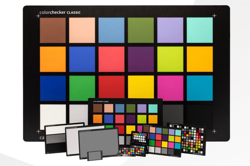
- ColorChecker Nano: Barely larger than a postage stamp, this minuscule chart is engineered for extreme macro photography, crucial for fields like jewelry, forensics, and scientific documentation where minute details and precise color are paramount.
- ColorChecker Mini: Designed for ultimate portability, this compact version easily slips into a photographer’s pocket or gear bag, making it ideal for on-the-go documentary work, travel photography, and everyday professional use.
- ColorChecker Classic: The enduring standard, providing the essential 24-patch reference for general photography and videography.
- ColorChecker XL: As its name suggests, this larger format is designed for broad scenes, capable of being read from a distance, making it suitable for architectural photography, large-scale product shoots, and film sets.
- ColorChecker Mega: The behemoth of the family, measuring approximately 1 x 1.5 meters, this chart can be deployed across vast fields or even from aerial platforms like drones, providing critical color reference for landscape surveys, large-scale event photography, and cinematic productions requiring wide establishing shots.
Beyond size variations, the ColorChecker ecosystem has expanded to include more specialized charts. The ColorChecker Digital SG (Scientific Grade), for instance, boasts an impressive 140 swatches, including the original 24 colors, an expanded 17-step grayscale for exceptionally fine tonal control, and a comprehensive 14-swatch skin tone chart. These 14 skin tones are a direct descendant of the two original skin tone patches developed in 1976, reflecting a growing understanding and commitment to accurately representing the full spectrum of human complexions.
Photographer Alan Shapiro attests to the critical importance of this expanded palette: "My clients are every shade, and getting their skin right the first time is everything. With a solid reference, I stop guessing and start delivering true to life, every session." Shapiro’s experience underscores how the ColorChecker not only ensures technical accuracy but also fosters client trust and satisfaction. He recounts a vivid example: "A client swore the red on their product was wrong. I pulled up the frame with the chart, matched it in seconds, and the debate was over." This anecdote perfectly illustrates the ColorChecker’s role as an objective arbiter, capable of resolving disputes and providing undeniable proof of color fidelity.
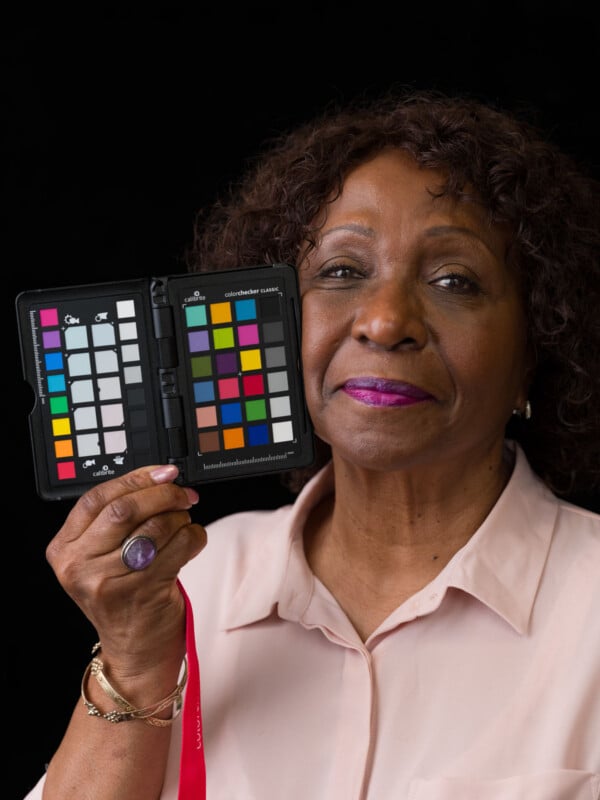
Another popular iteration, the ColorChecker Passport, combines multiple charts (Classic, White Balance, and Creative Enhancement) into a portable, protective case, offering a complete on-location color management solution for photographers and videographers. This convenience has made it an indispensable tool for professionals who require robust color control in dynamic environments.
Beyond the Lens: Scientific and Cosmic Applications

The ColorChecker’s utility extends far beyond the realm of artistic photography, finding critical applications in rigorous scientific and industrial fields. Its precise and consistent spectral reflectance properties make it an ideal tool for testing camera performance, evaluating the color of materials, and calibrating lighting systems in diverse research and development settings.
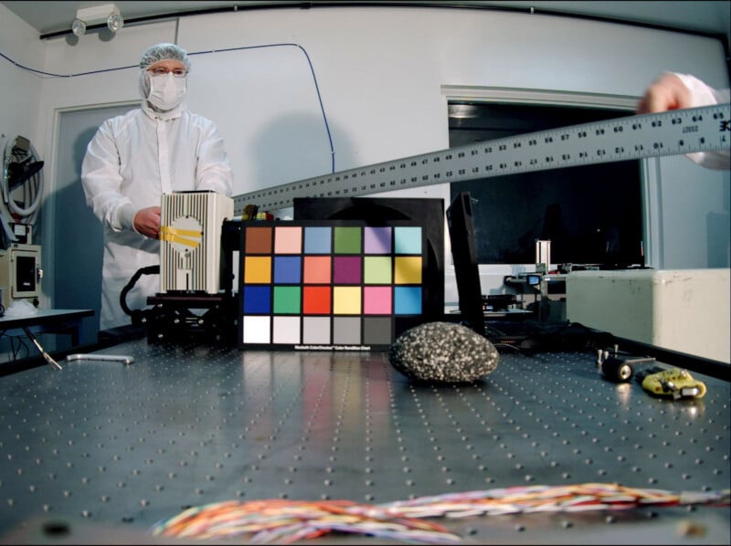
Perhaps most remarkably, the ColorChecker has ventured into the ultimate frontier: space. Its journey began even before leaving Earth, with NASA utilizing ColorChecker charts to meticulously test and calibrate the Mars descent imager, ensuring that the critical visual data captured from the Martian surface would be chromatically accurate upon transmission back to Earth. This demonstrates the profound trust placed in the ColorChecker’s ability to provide a reliable reference even in extraterrestrial environments.

In a more recent cosmic deployment, the X-Rite ColorChecker Classic was brought aboard the Chinese Tianhe core module of the Tiangong space station in 2021. The mission was clear: to ensure the accurate capture of photos and videos from within the spacecraft’s cabin. The lighting conditions in Earth orbit are notoriously complex and constantly shifting, influenced by solar angles, reflections from the Earth, and the internal illumination of the module. By utilizing the ColorChecker, the astronaut crew and ground control could correct for any color casts and ensure that the visual documentation relayed to people back on Earth was true-to-life, vital for both scientific reporting and public engagement. This extraordinary application underscores the ColorChecker’s robustness and indispensable nature in extreme, high-stakes environments where color accuracy is not just an aesthetic preference but a scientific imperative.
An Enduring Legacy in a Changing World

In the 50 years since its inception, nearly every facet of photography has undergone radical transformation. From bulky film cameras to mirrorless digital marvels, from darkroom chemicals to AI-powered editing suites, the technological landscape has shifted beyond recognition. Yet, amidst this relentless march of progress, the fundamental concern for accurate color remains constant. The question posed by its creators, "What color is this, really?", continues to echo through studios, laboratories, and even the vacuum of space.
The Calibrite ColorChecker’s remarkable consistency and timeless design are precisely why it has achieved iconic status. It has transcended its origins as a scientific instrument to become an indispensable companion to countless works of art, many of which now adorn the walls of prestigious museums and galleries worldwide. Its enduring relevance speaks to a deeper truth: regardless of technological advancements, the human eye’s perception of color and the need for a verifiable, objective standard remain paramount.
As we look towards the next 50 years, the role of physical color calibration targets like the ColorChecker will undoubtedly continue to evolve. In an increasingly AI-driven and computational photography landscape, these charts will likely serve as foundational reference points for training intelligent algorithms and validating the accuracy of advanced imaging systems. They provide the immutable ground truth against which any automated process can be measured.
The ColorChecker answered that question in 1976. It answers it now in 2026. And, with its fundamental scientific principles holding firm, it will undoubtedly continue to answer it in 2076 and beyond, cementing its legacy as an essential tool for anyone who cares about color.

Image credits: Calibrite