
Controlling color is not merely a technical adjustment in photography; it is a fundamental pillar of visual communication, shaping mood, conveying information, and influencing emotional responses. From the subtle shifts in hue that define a landscape to the deliberate palettes that underscore cinematic narratives, understanding and manipulating color is paramount for any photographer seeking to elevate their craft. This intricate relationship between light, perception, and artistic intent forms the bedrock of impactful imagery.
Deconstructing Color: From Wavelengths to Perception
At its core, color is a phenomenon rooted in physics and interpreted by biology. When light, a form of electromagnetic radiation, encounters a surface, some wavelengths are absorbed while others are reflected or transmitted. The specific wavelengths reflected are what our eyes perceive as color. For instance, a black surface absorbs nearly all incident light, reflecting minimal photons, while a white surface reflects most wavelengths. A green leaf, on the other hand, absorbs most colors of the visible spectrum and reflects only green light, a process vital for photosynthesis, where it absorbs ultraviolet light. This principle extends across the entire spectrum of visible colors.
The human visual system, however, processes only a tiny segment of the vast electromagnetic spectrum. Our eyes are equipped to perceive light within a range typically spanning from approximately 400 nanometers (violet) to 700 nanometers (red). This narrow band, known as visible light, is interpreted by specialized photoreceptor cells in the retina called cones. Humans possess three types of cones, each sensitive to different wavelengths—short (blue), medium (green), and long (red)—allowing for trichromatic vision, which enables us to distinguish millions of distinct hues. This biological filtering mechanism is crucial for our survival; if our eyes were sensitive to shorter, higher-energy wavelengths like X-rays or gamma radiation, these would cause severe damage. Fortunately, Earth’s atmosphere, particularly the ozone layer, largely filters out these dangerous frequencies. Conversely, perceiving much longer wavelengths, such as microwaves or radio waves, would necessitate ocular structures vastly larger than our current eyes, akin to the colossal dishes of radio telescopes. Therefore, the limited range of colors we perceive is a remarkable evolutionary adaptation, balancing information intake with physiological safety and efficiency.

It is critical to remember that color, as we experience it, is ultimately an illusion—a construct of the brain interpreting electrical signals from the optic nerve. Outside our bodies, the concept of "red" or "blue" as sensory qualities does not exist; there are only electromagnetic waves of varying frequencies. This subjective nature underscores why color control in photography isn’t about capturing an objective reality, but rather about manipulating perceived reality to evoke desired effects.
Mastering Color Temperature: The Kelvin Scale in Practice
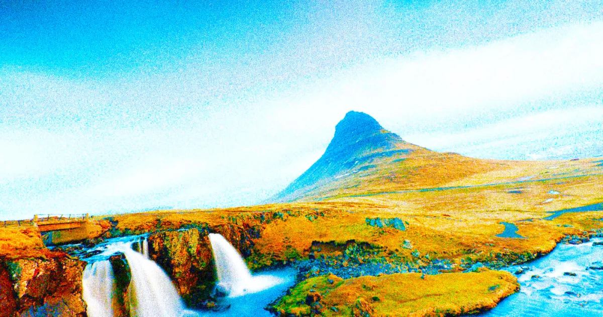
The color of light itself profoundly influences the mood and perception of a photograph. Psychologically, reds, oranges, and yellows are widely considered "warm" colors, often associated with energy, passion, or comfort. Conversely, blues and greens are typically seen as "cold," evoking serenity, sadness, or detachment. However, in the realm of physics, this perception is inverted: bluer light is actually hotter. This can be observed when heating a metal bar, which progresses from a dull red to orange, then yellow, and finally to a brilliant bluish-white as its temperature increases. Similarly, a Bunsen burner’s blue flame is significantly hotter than its yellow counterpart.
This physical relationship between light and temperature is quantified using the Kelvin (K) scale, a concept introduced by Lord Kelvin in the 19th century based on the theoretical "black-body radiator." In photography, the Kelvin scale is indispensable for achieving accurate white balance. Digital cameras and editing software like Adobe Lightroom or DxO PhotoLab utilize Kelvin measurements to correct color casts, ensuring that white objects appear neutral white regardless of the ambient light source. The white balance slider in these programs typically ranges from a cooler blue end (around 2000 K) to a warmer yellow end (up to 50,000 K). This seemingly counter-intuitive arrangement represents the correction required: to neutralize a blue cast, one adds warmer (higher Kelvin) tones, and vice versa.
A comprehensive understanding of typical color temperatures is invaluable:

- Candlelight: 1500-1900 K (Very warm, orange-red)
- Tungsten/Incandescent Bulb: 2500-3000 K (Warm, yellow)
- Sunrise/Sunset (Golden Hour): 2000-3000 K (Warm, soft oranges and reds)
- Fluorescent Light: 3000-4000 K (Cool, often with a green cast)
- Electronic Flash: 5000-5500 K (Neutral, daylight-balanced)
- Daylight (Midday Sun): 5000-6500 K (Neutral to slightly cool)
- Overcast Sky: 6500-7500 K (Cooler, bluish)
- Shade: 7000-8000 K (Very cool, distinctly blue)
- Blue Hour: 9000-12000 K (Intensely cool, deep blue)
Consider a photograph taken during the "blue hour," the period just before sunrise or after sunset when the sun is below the horizon. During this time, the atmosphere filters out red and orange wavelengths through Rayleigh scattering, leaving the sky predominantly blue. If snow is present in such a scene, it will appear distinctly blue. To render the snow white, a significant white balance correction is needed, often pushing the Kelvin slider to a much higher value, for example, from an initial 5778 K to 14,701 K, as demonstrated in the eagle example. However, photographers often make a conscious artistic choice to embrace the ambient blue hour tones, foregoing correction to preserve the unique ethereal quality of the light, as seen in the lighthouse image.
Beyond terrestrial applications, color temperature holds profound significance in astronomy. The colors of stars directly indicate their surface temperatures. Red giant and supergiant stars, like Aldebaran and Betelgeuse, are relatively cool, ranging from 3,000 to 4,000 Kelvin. Our Sun, a yellow dwarf, sits comfortably between 5,500 and 6,000 K. In contrast, blue B-type stars such as Regulus and Rigel are scorching hot, reaching temperatures of 12,000 to 14,500 K, a vivid illustration of the inverse relationship between perceived "warmth" and physical temperature.

Color as a Narrative Tool: Mood, Emotion, and Storytelling
The deliberate manipulation of color is a potent narrative device, capable of shaping emotional responses and guiding the viewer’s interpretation of an image or scene. In cinema, for instance, filmmakers expertly craft color palettes to define genre, period, and character psychology. Desaturated, muted tones, often leaning towards greys and washed-out hues, are frequently employed to evoke a sense of solemnity, grit, or emotional distance. Films like Saving Private Ryan, The Hurt Locker, and Tinker, Tailor, Soldier, Spy utilize this aesthetic to underscore themes of war, hardship, and moral ambiguity, stripping away emotional warmth.
Conversely, highly saturated and vibrant colors inject scenes with energy, playfulness, or heightened reality. The whimsical, meticulously curated palettes of Wes Anderson’s films, the energetic dynamism of Scott Pilgrim vs. the World, the romantic charm of Amélie, and the deliberate, vibrant artificiality of Barbie are prime examples. These films leverage color to create immersive, distinctive worlds that are inseparable from their narratives.

A landmark example of color as a narrative device is The Wizard of Oz (1939). Its revolutionary transition from sepia-toned monochrome to vivid Technicolor marked Dorothy’s journey from the mundane reality of Kansas to the fantastical realm of Oz. This was achieved using the advanced three-strip Technicolor process, which captured red, green, and blue light on separate film strips, allowing for rich, full-color reproduction. The stark contrast between the two visual styles profoundly amplifies the emotional impact of the story, making the arrival in Oz a breathtaking experience.
Another prevalent cinematic technique is the "teal and orange" color contrast, a staple in many Hollywood blockbusters. This scheme leverages complementary colors to make skin tones (which lean towards orange) pop against backgrounds that are often desaturated or shifted towards teal or blue. While orange evokes warmth and human connection, teal can simultaneously suggest coolness, danger, tension, or a futuristic, dystopian, or technological aesthetic. Its widespread use, while effective, has also led to discussions about its potential overuse and homogenization of visual styles in contemporary film.

Cultural Nuances of Color Meaning
Beyond universal psychological associations, the meanings attributed to individual colors and color combinations are profoundly shaped by cultural contexts, historical traditions, and even religious beliefs. What evokes one emotion in one society may trigger a completely different response in another.
- Red: Universally recognized for its intensity, red commonly signals love, passion, or warning. It also evokes energy, excitement, and physicality. However, in China, red is a highly auspicious color, symbolizing luck, celebration, and prosperity, frequently seen in weddings and New Year festivities. In some parts of South Africa, it can be associated with mourning, particularly in remembrance of blood shed during conflicts. Historically, red has also been linked to royalty and power in many European monarchies, and later, to revolutionary movements and communism.
- Orange: Often associated with enthusiasm, creativity, sociability, and warmth, orange is a vibrant and energetic color. In the Netherlands, it is the national color, symbolizing pride and the Royal House of Orange-Nassau. In Buddhism, it represents spiritual devotion and enlightenment, often seen in the robes of monks. Conversely, some Middle Eastern cultures may link it to mourning or loss.
- Yellow: Symbolizing optimism, clarity, happiness, and intellect in many Western cultures, yellow can also carry negative connotations such as cowardice or deceit. In Japan, it can represent courage and refinement. In parts of Latin America, particularly Mexico, yellow marigolds are associated with death and mourning during Día de los Muertos celebrations.
- Green: Widely representing harmony, growth, nature, calm, and renewal, green has strong positive associations. In Ireland, it is deeply tied to national identity and the lush landscape. In Islam, green is considered a sacred color, symbolizing paradise and resurrection. However, in some South American cultures, green can carry connotations of death, illness, or jealousy.
- Blue: Psychologically associated with trust, peace, reliability, and stability, blue is often perceived as calming. In Western cultures, it traditionally symbolizes masculinity, hence its common use for baby boys; however, this association is relatively recent, shifting from pink for boys and blue for girls in the early 20th century. In Greece, blue is believed to ward off the "evil eye," while in some Eastern traditions, it is connected with immortality and the divine.
- Indigo: Representing intuition, inner wisdom, deep thought, and spirituality, indigo is often associated with the "third eye" in spiritual traditions. Historically, in India, indigo was a valuable commodity, but its trade was often linked to colonial exploitation and harsh labor practices.
- Violet/Purple: Historically, violet and purple have denoted power, sophistication, royalty, and formality due to the rarity and cost of purple dyes. It also symbolizes mystery and, in the West, is widely associated with grief and mourning. In contrast, in China and India, it can sometimes represent bad luck or negativity.
- White: In many Western cultures, white symbolizes purity, innocence, and new beginnings, popularized at weddings by Queen Victoria. Historically, white was not the traditional bridal color. In the Middle East, it often represents purity and peace. However, in China, Japan, and India, white is the traditional color of mourning and funerals.
- Black: Associated with power, sophistication, formality, and mystery, black is also the predominant color of mourning in the West. In contrast to Western associations with elegance, in China and India, it can sometimes represent bad luck or negativity. In ancient Egypt, black was associated with fertility and the rich soil of the Nile.
- Gray: A neutral color, gray carries similar meanings across many cultures, symbolizing compromise, restraint, calm, order, impartiality, professionalism, and maturity (e.g., gray hair). While it can suggest sophistication in minimalism and luxury branding, too much gray can evoke feelings of loneliness, muted emotion, or demotivation. In some Eastern traditions, it may represent modesty, humility, wisdom, and the balance between light and dark.
- Brown: Not a spectral color, brown is a perceived color resulting from a combination of context, contrast, and brightness. Psychologically, it represents stability, reliability, comfort, and naturalness, suggesting earthiness and wholesomeness. While it can be seen as boring in some contexts, in Japan, brown is associated with modesty and everyday simplicity, and in other cultures, with humility or "plainness."
Understanding these diverse cultural interpretations is crucial for photographers, especially those working internationally or on projects with global reach. A color choice that resonates positively in one culture could inadvertently cause offense or misunderstanding in another.

The Technical Toolkit: HSL and Beyond
Digital raw development programs offer powerful tools for fine-tuning color, primarily through Hue, Saturation, and Luminance (HSL) adjustments. These sliders allow photographers to precisely control the individual components of color within an image.
- Hue: Refers to the pure color itself, its position on the color wheel. Adjusting the hue slider for a specific color (e.g., reds) shifts it towards its neighboring hues (e.g., towards orange or magenta), effectively changing the fundamental color.
- Saturation: Represents the intensity or purity of a color. Moving the saturation slider away from the center increases the vividness of the color, making it more vibrant. Conversely, decreasing saturation moves the color closer to neutral gray, reducing its intensity.
- Luminance: Dictates the brightness or darkness of a specific color. Increasing the luminance makes a color appear brighter (closer to white), while decreasing it makes the color darker (closer to black).
These HSL adjustments, while powerful, must be used judiciously. Over-manipulation can lead to unnatural, garish results or introduce unsightly artifacts like color banding, where smooth tonal transitions appear as distinct, stepped bands. Natural scenes rarely consist of single, pure colors; therefore, adjusting one HSL parameter without considering its interaction with others can disrupt the visual harmony of an image.

Beyond HSL, more advanced color manipulation techniques exist. Color grading involves a comprehensive approach to altering the color and tone of an image, often employing curves, split toning, and specific lookup tables (LUTs) to achieve a desired aesthetic or emulate a particular film stock. This allows for nuanced control over shadows, midtones, and highlights, shaping the overall mood and style. Selective color adjustments provide the ability to isolate and modify colors in specific areas of an image, drawing attention to key elements or correcting localized color casts without affecting the entire frame.
Color in Monochrome: The Power of Tone
Even in black and white photography, where hues are absent, the underlying color information remains critically important. The conversion from color to monochrome is not simply a desaturation; it is a process of translating color differences into tonal variations—different shades of grey. For instance, red berries against green leaves might appear vibrant in color, but when converted directly to black and white, they could blend together into a uniform grey if their original brightness levels were similar.

Raw development tools offer sophisticated controls for monochrome conversion, allowing photographers to adjust how individual original colors are translated into tones. By using channel mixers or virtual color filters, one can selectively brighten or darken specific colors. Applying a "red filter" effect, for example, will darken blue skies and green foliage while brightening red objects. Conversely, a "green filter" will brighten foliage and darken red elements. This granular control over tonal separation is what allows black and white photographers to sculpt light and create compelling contrast, texture, and depth, transforming a scene into a dramatic interplay of light and shadow. As with HSL adjustments, care must be taken to avoid exaggerated or unnatural tonal shifts.
Achieving Color Accuracy: Calibration and Management
For many photographers, especially those in commercial fields like product, fashion, or scientific photography, color accuracy is paramount. The goal is to reproduce colors in a photograph as closely as possible to how they appeared in real life, or at least how they are intended to be seen across different viewing platforms. Achieving this requires a robust color management workflow from capture to display to print.

Monitor calibration is the cornerstone of color accuracy. Devices such as the Datacolor SpyderX or X-Rite iDisplay Pro are essential tools that measure the color output of a display and create a custom profile, ensuring that colors are rendered consistently and accurately. Without a calibrated monitor, a photographer might edit an image to look "correct" on their screen, only to find it appears drastically different on another display or in print.
Color checkers and targets are invaluable for capturing accurate colors in-camera. Tools like the Datacolor Spyder Checkr Photo or X-Rite ColorChecker Passport consist of a grid of scientifically engineered color patches. By photographing these charts under specific lighting conditions, photographers can create custom camera profiles that correct for the unique color rendition of their camera sensor and lens combination under those exact lighting circumstances. This provides a neutral starting point for editing, drastically reducing the time spent on color correction in post-processing.

Finally, printer profiling addresses the challenges of translating digital colors to physical prints. Each printer, ink, and paper combination renders colors differently. Custom ICC profiles for specific printer-paper-ink setups ensure that printed output matches the colors seen on a calibrated monitor as closely as possible.
While some photographers intentionally deviate from absolute color accuracy for artistic expression, understanding the principles and tools of color management empowers them to make these choices consciously, rather than being at the mercy of inaccurate color reproduction.

The Dynamic Interplay of Colors: Harmony and Contrast
Colors do not exist in isolation; their impact is significantly influenced by their interaction with other colors within an image. Understanding color harmony and contrast is key to crafting visually compelling compositions.
- Complementary Colors: These are colors located directly opposite each other on the color wheel (e.g., red and green, blue and orange, yellow and purple). When placed side-by-side, complementary colors create strong visual contrast, making each color appear more vibrant and creating a sense of energy and visual tension. This contrast can be used to draw attention to specific elements or create a dynamic focal point.
- Analogous Colors: These are colors positioned next to each other on the color wheel (e.g., blue, blue-green, and green). Analogous color schemes create a sense of harmony, serenity, and visual calm. They are often found in nature and are effective for creating cohesive and pleasing compositions that are less jarring than complementary schemes.
- Triadic Colors: These involve three colors that are equidistant on the color wheel (e.g., red, yellow, and blue). Triadic schemes offer a balanced and vibrant palette, providing strong visual interest without overwhelming the viewer.
- Monochromatic Schemes: These utilize variations in lightness and saturation of a single hue. They create a subtle, elegant, and unified look, emphasizing texture and form over color contrast.
By consciously employing these principles of color interaction, photographers can guide the viewer’s eye, evoke specific emotions, and imbue their images with greater depth and purpose.

Conclusion: The Photographer as a Master of Light and Emotion
The journey to mastering color in photography is a continuous exploration of science, art, and perception. From the fundamental physics of light waves and their interaction with surfaces, through the biological marvel of human vision, to the intricate cultural tapestry of color meanings, every aspect contributes to the visual narrative. The technical tools of white balance, HSL adjustments, and color management provide the means, while an understanding of psychological and cultural associations provides the artistic direction.
Ultimately, a photographer who understands color is not merely capturing light but shaping emotion, telling stories, and creating worlds. Whether the goal is scientific accuracy, cinematic drama, or a deeply personal artistic statement, the ability to consciously control and deploy color empowers the photographer to communicate with unparalleled clarity and impact. The continuous study and experimentation with color are essential for any visual artist dedicated to pushing the boundaries of their craft and creating truly resonant images.