The Strategic Shift Toward Functional Communication
The modern philosophy of vehicle wrap design is rooted in the "moving billboard" concept, which operates under vastly different constraints than stationary signage or digital media. When a branded van or truck is parked, a pedestrian may have several minutes to admire the nuances of a logo or read a list of services. Conversely, when that same vehicle is traveling at 45 miles per hour, the window for communication shrinks to a mere two to three seconds.
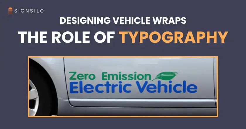
Industry analysts and design professionals now categorize typography as a functional component of the vehicle’s engineering rather than just a cosmetic addition. A high-performance wrap must solve the problem of "visual noise"—the surrounding traffic, roadside distractions, and weather conditions that compete for a viewer’s attention. To cut through this noise, designers are increasingly abandoning script-heavy or overly stylized typefaces in favor of high-contrast, clean-lined typography that ensures the brand name and contact information are legible from a distance of at least 50 to 100 feet.
The Physics of Mobile Advertising: The 2.5-Second Rule
The shift toward typographic dominance is supported by data regarding consumer behavior and visual processing. Research into Outdoor Advertising (OOH) suggests that drivers and pedestrians have an average of 2.5 seconds to identify a vehicle’s brand and purpose. If the typography is too thin, too compressed, or obscured by busy background graphics, the "impression" is lost.
In response, the industry has adopted a "less is more" approach. By utilizing bold weights and generous kerning (the space between characters), designers ensure that letters do not "blur" together when the vehicle is in motion. This technical requirement has made sans-serif fonts the preferred choice for the majority of commercial fleets. Their lack of decorative "feet" (serifs) allows for cleaner silhouettes, which are easier for the human brain to process rapidly.
A Chronology of Vehicle Branding Evolution
To understand the current dominance of typography, one must examine the technological and stylistic timeline of the industry:

- The Era of Hand-Painting (Pre-1980s): Branding was limited to the skills of sign painters. Typography was essential but constrained by the time and cost of manual labor.
- The Rise of Cut Vinyl (1980s–1990s): Plotter-cut vinyl allowed for sharper letters and more consistency. Most vehicles featured simple text and basic logos on doors or panels.
- The Digital Print Revolution (2000s–2010s): The advent of wide-format digital printing allowed for "full wraps." This era saw an explosion of "busy" designs, including photos of products, flames, and complex textures, often at the expense of legibility.
- The Typographic Correction (2020–Present): After years of visual saturation, the market is correcting. Brands have realized that a vehicle covered in a beautiful but unreadable photo generates fewer leads than one with clear, bold typography.
SignSilo and the Digital Optimization of Typography
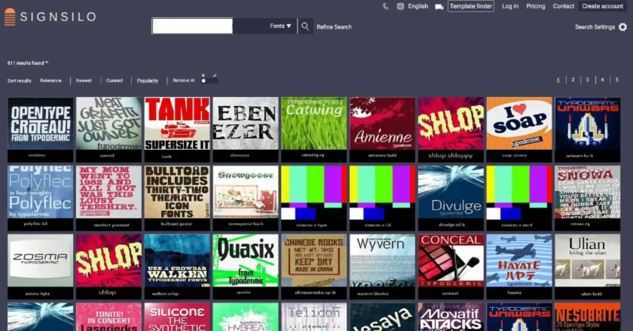
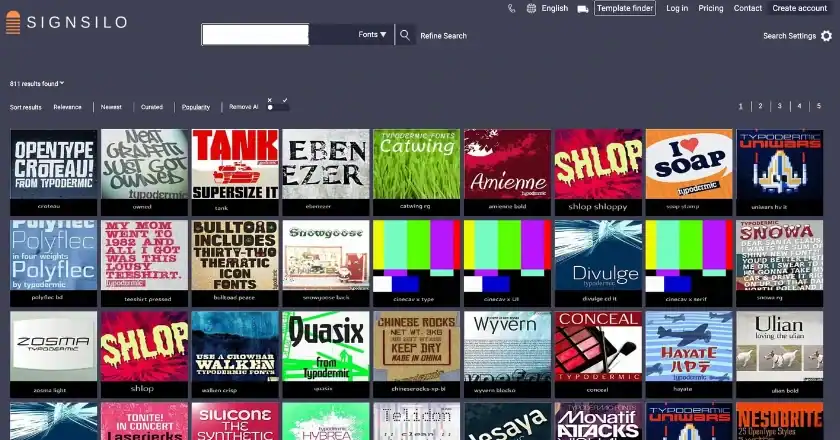
The demand for precision in mobile typography has led to the adoption of specialized tools and libraries. SignSilo has emerged as a critical resource in this space, providing designers with a curated ecosystem of professional fonts specifically vetted for large-scale application. Unlike standard web or print fonts, the typefaces used in vehicle graphics must maintain their integrity when scaled up by 1,000% or more.
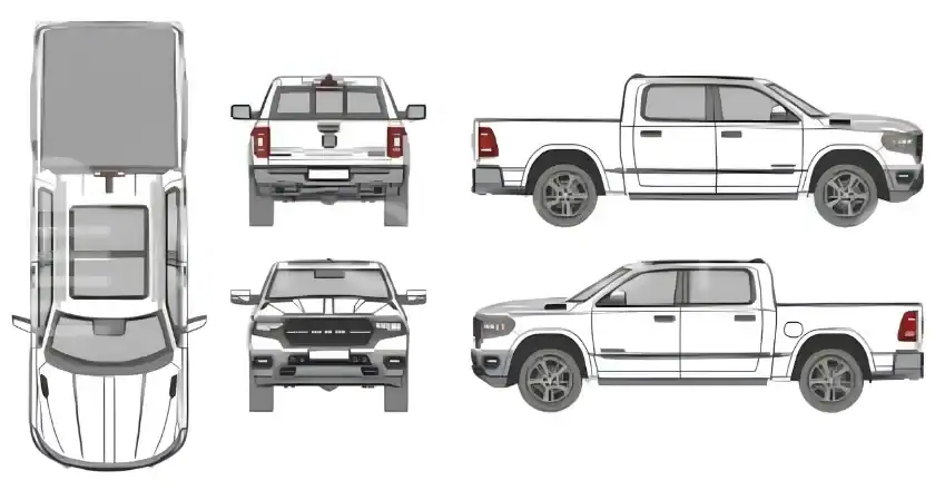
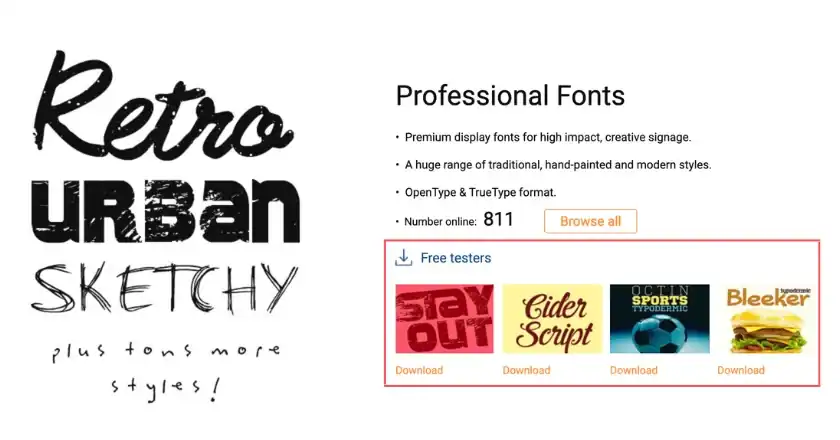
The integration of "font tester" files represents a significant advancement in the design workflow. These tools allow designers to overlay specific typefaces onto 3D vehicle templates before a single inch of vinyl is printed. This testing phase is crucial because the three-dimensional nature of a vehicle—with its curves, door handles, and recessed panels—can distort text in ways that a flat computer screen cannot predict. By visualizing how a specific font weight interacts with the wheel well of a Ford Transit or the sliding door of a Mercedes Sprinter, designers can make adjustments that ensure the text remains "true" from every viewing angle.
Statistical Impact and ROI of High-Legibility Design
Data from the Outdoor Advertising Association of America (OAAA) indicates that a single intra-city vehicle wrap can generate between 30,000 and 70,000 impressions daily. When the typography is optimized for legibility, the "recall rate"—the ability of a viewer to remember the brand later—increases by as much as 15%.
For small to medium enterprises (SMEs), the ROI of a typographically focused wrap is significantly higher than that of a photo-heavy design. A clear brand name and a large, legible phone number or URL act as a direct lead-generation tool. In contrast, an overly artistic wrap may be "liked" by viewers but fails to communicate who to call, resulting in "lost impressions."
The Psychology of Font Choice in Brand Identity
While legibility is the primary goal, typography also serves as a psychological shorthand for a brand’s personality. Designers are no longer just picking "clear" fonts; they are selecting typefaces that communicate industry-specific values:
- Modern Sans-Serifs: Used by technology and modern service companies to convey efficiency, speed, and innovation.
- Heavy Slab Serifs: Often utilized by construction and landscaping firms to communicate durability, strength, and reliability.
- Rounded Geometrics: Popular among home service brands (like plumbing or cleaning) to appear approachable, friendly, and trustworthy.
This strategic selection ensures that even if a viewer cannot read every word, the style of the typography begins to tell the brand story instantly.

Technical Execution: Overcoming Vehicle Geometry
The "star" status of typography is also a result of its ability to solve the technical challenges of vehicle wrapping. Graphics professionals must navigate "dead zones" on a vehicle—areas like deep body lines, handles, and fuel doors where important information should never be placed.
By prioritizing typography, designers can create a "modular" system. Instead of trying to wrap a complex photograph around a difficult corner, they can position clean text on the flattest, most visible parts of the vehicle. This not only improves the look of the wrap but also its longevity. Vinyl is less likely to fail or peel when it is applied to flat surfaces, and because text-based designs often use less ink saturation than full-bleed photos, they are sometimes more resistant to UV fading over time.
Strategic Implications for Fleet Managers
For fleet managers overseeing dozens or hundreds of vehicles, the shift toward typography-centric design offers logistical advantages. Maintaining brand consistency across a diverse fleet—which may include everything from compact cars to heavy-duty trailers—is significantly easier when the core identity is built on a robust typographic system.
A consistent font family can be scaled and rearranged to fit any vehicle footprint while remaining instantly recognizable. This "systemic" approach to design reduces the time required to onboard new vehicles into the fleet and ensures that the brand remains cohesive, regardless of the vehicle’s make or model.
Conclusion: The Future of Typographic-First Design
As we move further into an era of automated driving and increased urban density, the role of the vehicle as a communication tool will only grow. The industry is already seeing a move toward "minimalist" wraps where the company name, rendered in a bespoke or highly distinctive typeface, is the only element on the vehicle.
This evolution confirms that typography is no longer just a way to "write" a message on a van; it is the message itself. By focusing on the science of legibility, the psychology of font choice, and the practicalities of vehicle geometry, the graphics industry has turned typography into the most powerful tool in the mobile marketing arsenal. The next generation of fleet graphics will likely be defined by this "less is more" philosophy, where the most successful brands are the ones that can be "read" the fastest on a crowded highway.