Every photographer, regardless of skill level, inevitably encounters images that are technically proficient—correctly exposed, sharply focused, and adequately composed—yet lack a certain captivating quality, often described as feeling "flat" or "unfinished." The distinction between a merely decent photograph and a truly compelling one frequently hinges on the application of subtle, yet powerful, post-processing refinements. In an era where digital imaging tools are becoming increasingly sophisticated, the ability to imbue an image with emotional depth and visual impact has become paramount for photographers seeking to elevate their work.
The Evolving Landscape of Digital Photo Editing
The journey of a photograph from capture to final presentation is rarely complete without post-processing. Historically, this involved darkroom techniques, but the digital age has ushered in a new era of software-driven enhancements. Modern photo editing applications offer a vast array of tools designed to correct imperfections, enhance features, and express a photographer’s unique artistic vision. Among these, Skylum’s Luminar Neo has carved a significant niche, particularly for its integration of artificial intelligence (AI) to streamline complex editing tasks.

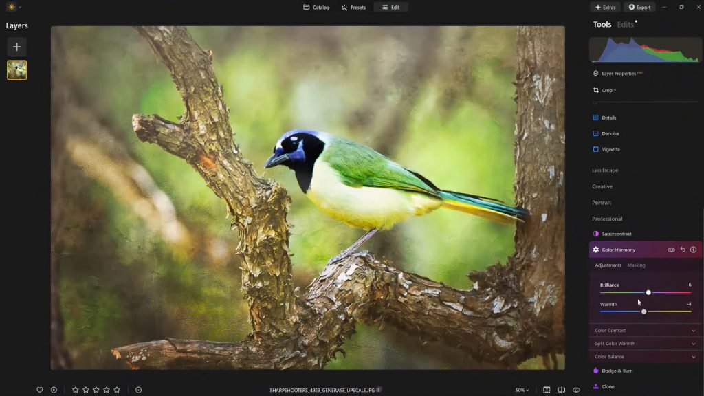
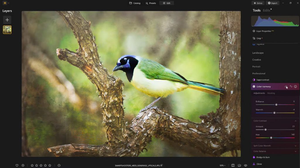
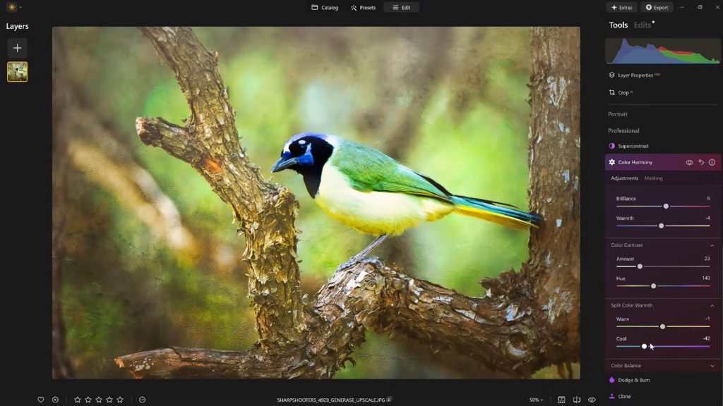
Luminar Neo represents a notable advancement in photo editing, aiming to democratize professional-grade tools by making them more intuitive and accessible. Its architecture is designed to allow photographers to achieve sophisticated results without needing an extensive background in complex manual adjustments. This philosophy extends to its "Professional Tools" section, where powerful features are often subtly integrated, allowing for deep control when needed, but without overwhelming the user with unnecessary complexity. It is within this section that the "Color Harmony" tool resides, a feature that, despite its immense potential, is frequently overlooked by many users.
Color Harmony: The Unsung Hero of Visual Refinement
Color Harmony in Luminar Neo is not designed for drastic, overt transformations. Instead, its strength lies in providing nuanced control over the intricate relationships between colors within an image. It offers a suite of precise adjustments—Brilliance, Warmth, Color Contrast, Split Warmth, and Color Balance—each contributing to the overall coherence and emotional resonance of a photograph. The judicious application of these controls allows photographers to fine-tune tone, contrast, and color balance, guiding the viewer’s eye and establishing a cohesive mood that aligns with the scene’s inherent lighting and narrative. This level of precise control is crucial because the human eye is remarkably sensitive to color shifts, and even minor adjustments can profoundly alter the perceived atmosphere and impact of an image.
The development of such sophisticated color management tools reflects a broader trend in the photo editing industry: moving beyond simple saturation and vibrance sliders to offer more intelligent and context-aware adjustments. As photography continues its global expansion, with an estimated 1.8 trillion photos taken annually, the demand for tools that can help images stand out in a crowded visual landscape intensifies. Luminar Neo’s Color Harmony is a direct response to this demand, offering a bridge between technical correctness and artistic expressiveness.

Dissecting the Elements of Color Harmony
Brilliance and Warmth: Sculpting Light and Mood
The Color Harmony tool’s journey often begins with Brilliance. Unlike standard saturation adjustments that can uniformly intensify all colors, potentially leading to an artificial or "cartoonish" look, Brilliance offers a more refined approach. It subtly increases or decreases the vividness of colors, lending them a richer tone while meticulously preserving natural detail and texture. The key, as emphasized by leading educators such as Vanelli, Skylum’s Director of Education, is moderation. Slight enhancements can breathe life into an image, making colors pop with natural vibrancy. Overdoing it, however, risks pushing the image into an unnatural aesthetic, detracting from its authenticity. This subtle distinction highlights the tool’s focus on refinement over exaggeration.
Similarly, Warmth operates with a gentle touch. Shifting the slider to the right introduces a golden, inviting glow, reminiscent of late afternoon sunlight. Conversely, moving it to the left cools the image, evoking a more serene or melancholic atmosphere. The strategic application of warmth is critical for matching the emotional tenor of a photograph. A landscape shot at dawn might benefit from a touch of warmth to convey the emerging light, while a somber portrait could gain depth from cooler tones. This control over color temperature, when applied thoughtfully, adds significant depth and atmosphere without overpowering the original scene. The ability to fine-tune warmth precisely allows photographers to tell a story through color, influencing the viewer’s emotional connection to the image.
Color Contrast and Split Warmth: Defining Relationships and Separations
Moving deeper into the Color Harmony toolkit, Color Contrast provides a mechanism to increase the visual tension between different color ranges, particularly those found in highlights and shadows. This isn’t about increasing overall luminance contrast, but rather about how different hues interact. When applied with discernment, Color Contrast can enhance the perception of depth, allowing elements within the image to stand out with greater clarity and dimension without appearing overly processed or HDR-like. It helps define forms and textures by creating subtle chromatic separations that the human eye naturally interprets as depth. This is particularly useful in complex compositions where distinct visual planes need to be articulated.

Split Warmth, on the other hand, offers an even more granular level of control over the warm and cool tones within an image. Unlike the global Warmth slider, Split Warmth allows photographers to selectively adjust the temperature of specific tonal ranges—for instance, warming the highlights while simultaneously cooling the shadows, or vice versa. This functionality is invaluable for correcting complex lighting scenarios, such as mixed lighting conditions where a scene might have both warm artificial light and cool ambient light. It also empowers photographers to create deliberate color separations in layered compositions, making certain elements recede or advance visually. However, its application is not universal; some images naturally possess harmonious color relationships that do not require this level of intricate adjustment. Its presence, nonetheless, signifies Luminar Neo’s commitment to providing comprehensive control for advanced users.
Color Balance: The Pinnacle of Targeted Tonal Adjustment
The most advanced component within Color Harmony is arguably Color Balance. This feature provides independent control over the color tones present in shadows, midtones, and highlights. This tripartite division allows for highly targeted adjustments, enabling photographers to precisely tailor the color atmosphere of an image. For example, subtly shifting the midtones towards warmer hues can transform a neutral landscape into a more inviting scene, while cooling the shadows can add a sense of mystery or depth. In portraiture, meticulous adjustments to midtone color balance can ensure accurate and pleasing skin tones, a critical aspect of professional image making.
The power of Color Balance lies in its ability to achieve consistent color grading across an entire series of photographs. For photographers working on projects or client deliverables, maintaining a cohesive visual style is paramount. Once mastered, Color Balance becomes an indispensable tool for establishing a signature look or ensuring visual continuity, offering a level of precision that transcends simple global adjustments. It enables the creation of complex color palettes that evoke specific emotions or reinforce a brand identity, making it a cornerstone for professional workflows.
Vignettes: Guiding the Viewer’s Gaze with Subtlety
Once the intricate color adjustments are complete, the strategic application of a vignette serves as a powerful complementary tool. A vignette subtly darkens the edges of an image, while often introducing a touch of "Inner Light" in the center. This creates a visual spotlight, drawing the viewer’s attention directly towards the main subject. The beauty of a well-executed vignette is its unobtrusiveness; it enhances focus without resorting to heavy masking or complex local adjustments, which can often appear artificial or overdone.
The use of vignetting is deeply rooted in the history of photography and visual art, serving as a compositional device to frame and emphasize. In digital editing, Luminar Neo’s implementation allows for precise control over the size, shape, and intensity of the vignette, ensuring it complements the image rather than detracting from it. When employed thoughtfully, vignetting transforms into a quiet yet potent storytelling element, directing the viewer’s experience and reinforcing the narrative of the photograph without explicitly calling attention to itself.
Establishing Workflow and Consistency: The Power of Presets
A crucial aspect of any professional photo editing workflow is the ability to maintain consistency and efficiency. After meticulously dialing in the desired aesthetic using Color Harmony and other tools, saving the resulting adjustments as a custom preset is an essential step. This practice offers multiple benefits:
- Consistency: It ensures a uniform editing style across a series of images, which is vital for professional portfolios, client projects, and personal branding.
- Efficiency: Presets provide a quick baseline for future edits, allowing photographers to apply a complex set of adjustments with a single click and then fine-tune as needed.
- Refinement: Presets preserve the ability to revisit and refine an image over time. It’s common for photographers, after a break, to notice areas where an edit might have been pushed too far. With a saved preset, the effect can be reapplied at a reduced strength (e.g., 70-80%), maintaining the core aesthetic while softening any over-editing. This iterative refinement process is key to achieving a polished, natural-looking final product.
The ability to create and manage custom presets underscores Luminar Neo’s utility as a tool for both creative expression and practical workflow management. It empowers photographers to develop a distinct visual signature and apply it consistently, thereby enhancing their overall productivity and artistic control.
Broader Implications and Industry Context
The emphasis on subtle yet impactful finishing touches, as exemplified by Luminar Neo’s Color Harmony, reflects a maturing trend in digital photography. The initial excitement over dramatic, one-click transformations is giving way to a greater appreciation for nuanced adjustments that preserve authenticity while elevating visual appeal. This shift is partly driven by the sheer volume of imagery online; in a visually saturated world, images that stand out often do so not through overt manipulation, but through refined aesthetics and emotional resonance.
Skylum, as a developer, has positioned Luminar Neo as a robust alternative in a competitive market dominated by established players. By integrating advanced AI capabilities with granular manual controls, they cater to a wide spectrum of users, from hobbyists seeking intuitive enhancements to professionals demanding precision. The insights from industry experts like Vanelli, who serves as Skylum’s Director of Education, are crucial in guiding users to unlock the full potential of such tools. His extensive background, transitioning from a Triple Crown Karate champion to a revered educator in visual arts, highlights a dedication to mastery and effective instruction. Vanelli’s contributions, through educational content, videos, and hosting the "Luminar Coffee Break" show, underscore the importance of understanding not just what a tool does, but how and why to use it effectively.
The continuous development of features like Color Harmony ensures that Luminar Neo remains at the forefront of photo editing innovation. It addresses the fundamental need of photographers to move beyond technical correctness and instill their images with deeper meaning and aesthetic appeal. For those looking to add that elusive polish without resorting to heavy-handed processing, Luminar Neo offers a sophisticated yet accessible suite of tools that strike the right balance between control and creative freedom.
In an effort to support photographers in exploring these advanced capabilities, Skylum occasionally provides promotional offers. For instance, new users can often avail a discount on Luminar Neo subscriptions or licenses. As an example, a 10% discount on Luminar Neo may be available using a specific code such as NATURETTL at checkout, providing an accessible entry point to a powerful editing ecosystem. Such initiatives reflect the company’s commitment to expanding its user base and empowering more photographers to achieve their creative aspirations.