The Evolution of Mobile Advertising: From Illustration to Information
The history of vehicle branding has undergone several distinct phases. In the mid-20th century, hand-painted signage was the standard, often featuring elaborate scripts and artisanal flourishes. The 1990s saw the introduction of wide-format digital printing and high-performance vinyl wraps, which led to a "maximalist" era. During this period, designers frequently overwhelmed vehicle surfaces with high-resolution photographs, complex gradients, and busy illustrations.
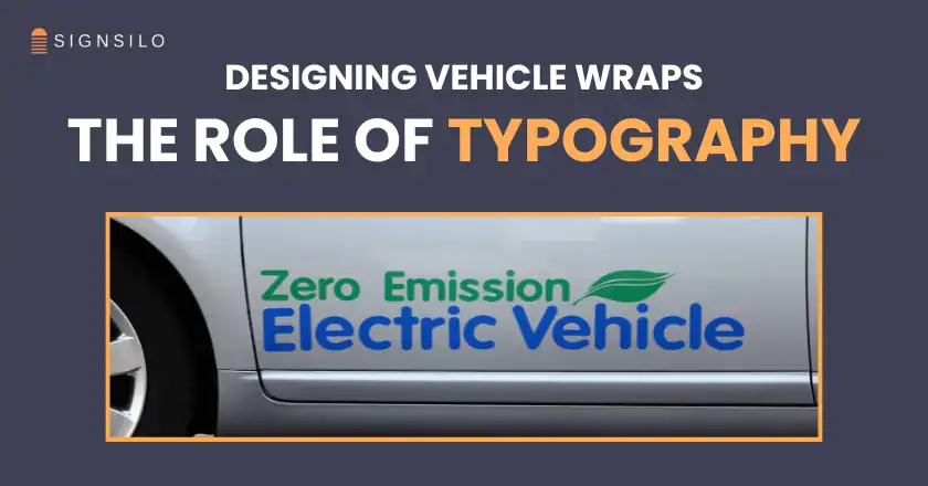
However, industry data from the Outdoor Advertising Association of America (OAAA) suggests that a vehicle can generate between 30,000 and 70,000 impressions daily. The critical finding for modern designers is that the vast majority of these impressions occur in a "dwell time" window of three to five seconds. In this brief interval, the human brain struggles to process complex imagery and text simultaneously. Consequently, the industry has entered a new era where typography is no longer a secondary element placed on top of a photo, but the central architecture of the design.
The Science of Legibility at Speed
Professional fleet designers are increasingly adopting principles from highway signage and cognitive psychology to ensure maximum impact. The shift toward clean, sans-serif typefaces is not merely a trend but a functional requirement for safety and effectiveness.
The Three-Second Rule
When a vehicle travels at 60 miles per hour, it covers 88 feet per second. A viewer traveling in the opposite direction or standing on a sidewalk has a vanishingly small window to identify the brand. Studies in visual ergonomics indicate that sans-serif fonts with large x-heights (the height of the lowercase letters) are significantly easier to read at high speeds than serif or decorative scripts. This is because the lack of "flourishes" reduces visual noise, allowing the eye to recognize letterforms instantly.
Contrast and Hierarchy
Supporting data from the Color Marketing Group emphasizes that high-contrast pairings—such as white text on a dark blue background or black text on a yellow field—can increase readability by up to 40%. Designers are now utilizing typographic weight (the thickness of the lines) to create a visual hierarchy. The company name is typically rendered in a "Bold" or "Black" weight, while services and contact information are presented in "Medium" or "Regular" weights. This ensures that even if a viewer only catches a glimpse, they at least register the primary brand name.

SignSilo and the Technological Shift in Font Selection
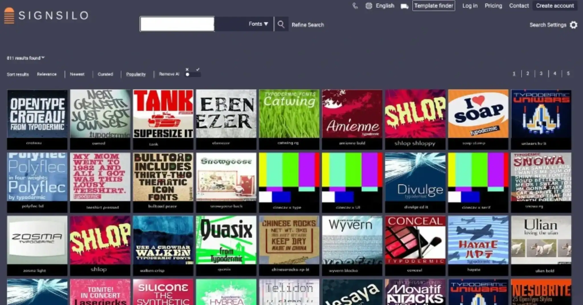
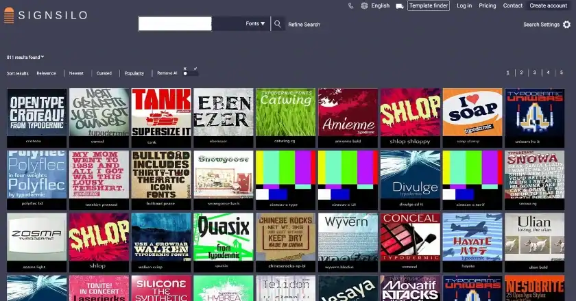
The emergence of specialized resources like SignSilo has revolutionized how designers approach font selection for vehicle wraps. In the past, designers often used standard system fonts or generic libraries that were intended for print or web use. SignSilo provides a curated library specifically tailored for the signage and vehicle wrap industry, offering professional-grade fonts that maintain their integrity when scaled to the size of a commercial van or a 53-foot trailer.
One of the most significant advancements in this sector is the introduction of "font tester files." These tools allow designers to simulate how a typeface will appear across the complex curves and recessed panels of a vehicle’s body. A font that appears balanced on a flat 24-inch monitor can often become distorted when applied to a curved fender or interrupted by a door handle. By testing these typefaces in a virtual environment before the vinyl is printed, firms can avoid costly errors and ensure that the brand’s "typographic personality" remains consistent.
Chronology of Vehicle Wrap Design Trends
To understand why typography has taken center stage, it is helpful to look at the timeline of the industry’s development:
- 1950s–1980s: The Hand-Lettering Era. Branding was limited to doors and tailgates. Typography was artistic but lacked the scalability and consistency required for large fleets.
- 1990s: The Vinyl Revolution. The introduction of pressure-sensitive vinyl allowed for full-color wraps. The focus was on "wraps as art," often resulting in cluttered, hard-to-read designs.
- 2000s: The Digital Photography Peak. Improvements in print resolution led to "photo-heavy" designs. Branding often became lost behind large images of products or landscapes.
- 2015–Present: The Typographic Renaissance. A return to minimalism. Brands like Uber, Amazon, and FedEx have set the standard for clean, type-driven vehicle graphics that prioritize instant recognition over decorative flair.
Industry Reactions and Professional Analysis
Graphic design experts and fleet managers have noted that the move toward typographic simplicity is also a move toward better Return on Investment (ROI). "A wrap that looks like a masterpiece in a portfolio but cannot be read from 50 feet away is a failed marketing asset," says one industry analyst.
The consensus among professional wrap installers is that typography-centric designs are also more durable and easier to maintain. Large, complex photographic wraps often show wear and tear more quickly, especially in areas where the vinyl must be stretched over deep channels. In contrast, clean typographic layouts often utilize the vehicle’s natural lines, leading to a cleaner application and a longer-lasting visual impact.
Furthermore, there is a growing realization that typography is the brand. For service-based industries—such as plumbing, electrical, or home security—the "personality" of the font does the heavy lifting of the marketing. A bold, geometric sans-serif communicates reliability and modernity, while a refined, modern serif might communicate luxury or heritage.

Strategic Implications for Modern Fleets
The shift toward typography as the "star" of the design has several long-term implications for the industry:
- Consistency Across Platforms: By focusing on a strong typographic system, companies can ensure their vehicles match their mobile apps, websites, and social media presence. This creates a "omnichannel" brand experience.
- Scalability: A type-driven design can be easily adapted from a small compact car to a large box truck without losing its visual core.
- Cost-Efficiency: Simplified designs often require less ink and can sometimes be executed using "spot graphics" rather than full wraps, reducing material costs while maintaining high visibility.
- Regulatory Compliance: In many jurisdictions, commercial vehicle lettering is subject to specific size and legibility requirements. Typographic-first designs ensure that these legal standards are met without compromising the aesthetic.
Conclusion: The Future of the Mobile Billboard
As we look toward the future, the role of typography in vehicle wrap design is only expected to grow. With the rise of autonomous vehicles and "smart cities," the vehicle surface may eventually become a digital display. Even in that high-tech future, the core principles of typography—clarity, contrast, and hierarchy—will remain the most important tools for any brand looking to capture attention in a moving world.
The modern fleet designer’s challenge is no longer about how much information can be crammed onto a vehicle, but rather how much can be stripped away to leave only the most potent message. In the high-speed environment of 21st-century commerce, the most distinctive brand is not the one with the most colors or the largest photos, but the one whose name can be read, remembered, and recognized in the blink of an eye. Typography has claimed its place as the star of the show because, on the road, communication is the only thing that truly moves the needle.