The landscape of mobile advertising is undergoing a fundamental transformation as professional designers pivot from complex, image-heavy graphics toward a more disciplined, typography-centric approach. For decades, vehicle wraps were characterized by vibrant gradients, photographic explosions, and intricate illustrations that aimed to capture attention through sheer visual volume. However, as the saturation of the outdoor advertising market increases, industry experts are identifying a critical shift: the most effective branded vehicles are no longer those with the most "art," but those with the most legible and strategically placed text. This evolution marks the rise of typography as the primary driver of fleet branding, moving it from a secondary support element to the central protagonist of commercial design.
The Functional Shift in Mobile Communication
The core of this trend lies in a simple but profound distinction between static and mobile environments. When a branded vehicle is parked, viewers have the luxury of time to examine fine details, read long-form copy, and admire artistic flourishes. However, the vast majority of a vehicle’s impressions are generated while it is in motion. On a highway or at a busy intersection, a wrap has approximately 2.5 to 3 seconds to communicate its message before the vehicle passes out of the observer’s line of sight.
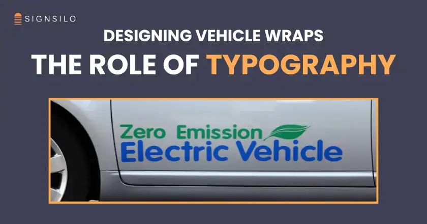
In this high-velocity context, elaborate scripts and decorative typefaces act as visual noise. Professional fleet designers are increasingly adopting a "function over form" philosophy, prioritizing clean, high-contrast sans-serif fonts that can be decoded by the human brain almost instantaneously. This shift is not merely an aesthetic preference but a response to the cognitive realities of "glance-based" marketing. By focusing on typography, designers ensure that the company’s name, service, and contact information are the first things a viewer sees, rather than the last.
The Role of Industry Resources: The SignSilo Case Study
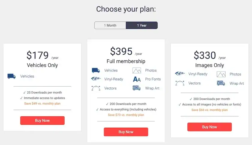
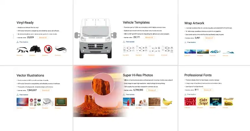
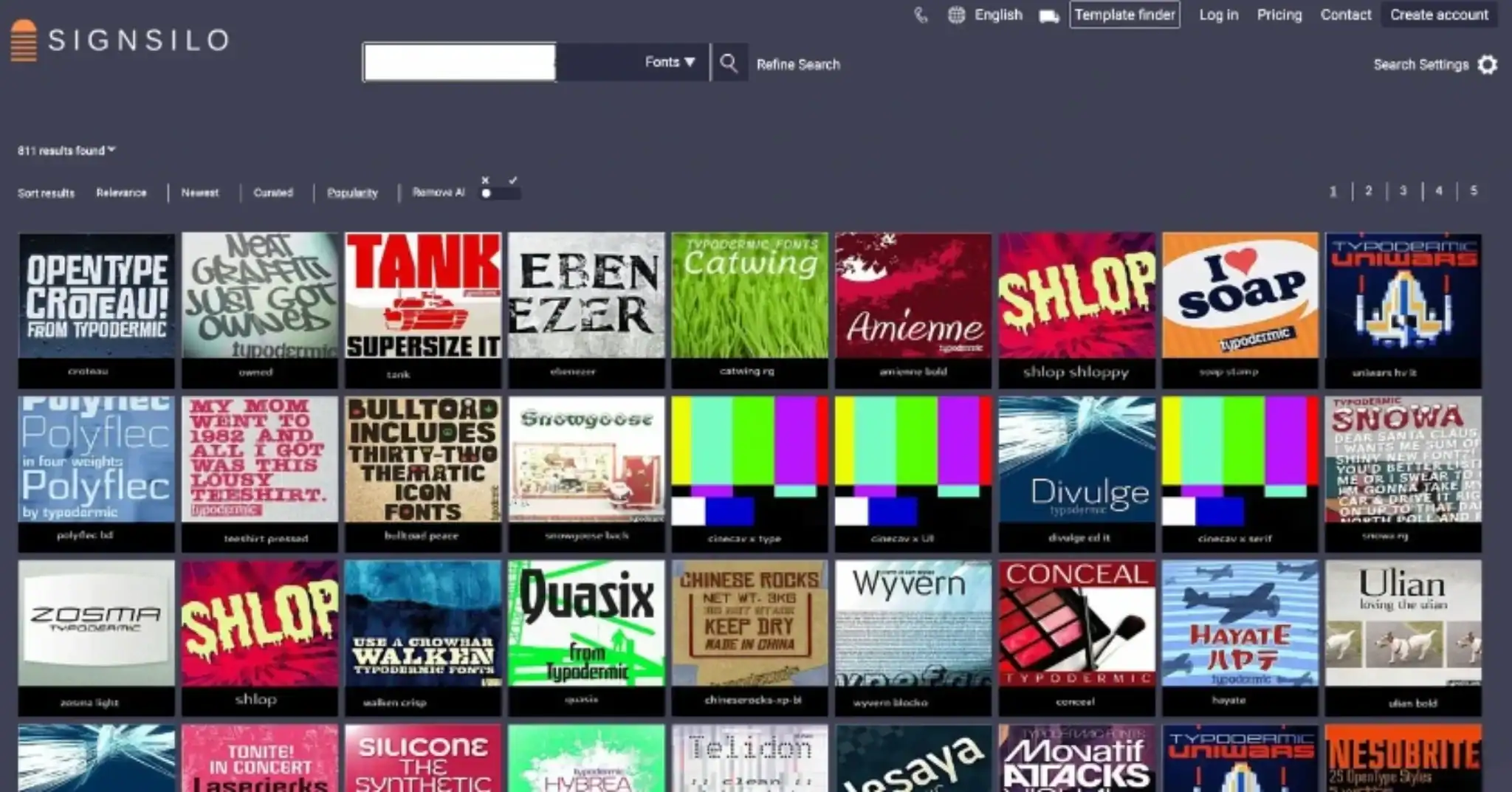
As the demand for high-performance typography grows, the tools available to designers have become more specialized. SignSilo has emerged as a significant player in this space, providing a specialized infrastructure for vehicle graphics professionals. Unlike general font libraries, the SignSilo professional font library is curated specifically for the sign and wrap industry, offering typefaces that maintain their integrity when scaled to the size of a transit van or a semi-trailer.
The challenge for any designer is finding a font that balances brand personality with "road-readiness." A technology firm requires a different typographic "voice" than a landscaping company or a luxury catering service. SignSilo addresses this by offering a broad spectrum of styles—ranging from authoritative geometric sans-serifs to approachable handwritten scripts—while ensuring each is optimized for large-format printing.

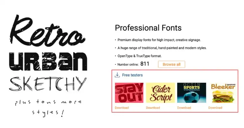
Furthermore, the introduction of font tester files has changed the workflow of the design process. These tools allow designers to stress-test a typeface within a specific vehicle template before a single inch of vinyl is printed. Testing for weight, spacing (kerning), and vertical alignment (leading) ensures that a font which looks sophisticated on a 27-inch monitor does not become a blurred mess when viewed from 50 feet away on a moving vehicle.
A Chronology of Vehicle Branding Evolution
To understand why typography has taken center stage today, it is necessary to look at the historical trajectory of vehicle branding:
- The Hand-Painted Era (Pre-1980s): Branding was limited by the skill of the sign painter. Typography was dominant because it was the most practical way to identify a business.
- The Cut-Vinyl Revolution (1980s–1990s): The introduction of plotters allowed for sharper logos and more consistent lettering, but designs remained relatively simple and text-focused due to the limitations of single-color vinyl sheets.
- The Digital Print Explosion (2000s–2010s): The advent of wide-format digital printing removed all creative barriers. This led to an era of "over-design," where wraps were treated like rolling murals, often sacrificing legibility for visual spectacle.
- The Minimalist Correction (2020–Present): Data-driven design has led to a return to simplicity. Modern designers now recognize that "less is more," leading to the current era where bold, clear typography is used to cut through the digital and physical clutter of modern life.
Supporting Data: The Impact of Mobile Impressions
The shift toward typographic clarity is backed by significant marketing data. According to the Outdoor Advertising Association of America (OAAA), a single vehicle wrap can generate between 30,000 and 70,000 impressions per day, depending on the region and mileage. Furthermore, mobile advertising has been found to have a 97% recall rate among viewers, significantly higher than traditional static billboards.
However, recall is only possible if the information is legible. Research into "distracted viewing" suggests that high-contrast typography—specifically dark text on a light background or vice versa—increases reading speed by up to 40% in outdoor environments. By prioritizing typography, businesses are effectively increasing the Return on Investment (ROI) of their fleet, as more viewers are able to successfully process and remember the brand’s call to action.
Engineering for Movement: The Designer’s Checklist
Professional designers are moving away from decoration and toward "communication design." When developing a typography-heavy wrap, several technical factors are now considered mandatory:
- Aperture and X-Height: Fonts with large open spaces (apertures) and tall lower-case letters (x-height) are preferred because they remain legible even when blurred by motion.
- Color Contrast: Designers are adhering more strictly to color theory, ensuring that text has at least a 70% contrast ratio against its background to meet visibility standards.
- Visual Hierarchy: The company name is typically given the largest "point size," followed by the primary service. Secondary information, such as social media handles or physical addresses, is being minimized or removed entirely to reduce clutter.
- Contour Awareness: Designers must account for the vehicle’s "body lines." Typography is strategically placed on flat panels (like the sides of a box truck) or carefully distorted to wrap around the curves of a van without breaking the word’s shape.
Industry Reactions and Expert Perspectives
Industry leaders in the vehicle wrap sector have noted that clients are becoming more sophisticated in their requests. While business owners used to ask for "something that pops," they are now asking for "something that reads." This shift in client expectations reflects a broader understanding of brand identity.

"Typography is the voice of the brand," says one senior fleet consultant. "If your wrap is too busy, you’re essentially whispering in a hurricane. Bold, clean typography is how you shout." This sentiment is echoed by wrap installers, who note that simpler, type-driven designs often have a longer aesthetic lifespan. Trends in graphic illustrations may fade after a few years, but classic, well-executed typography remains professional and relevant for the entire life of the vehicle’s wrap.
Broader Impact and Future Implications
The elevation of typography in vehicle design is part of a larger movement toward "Flat Design" and minimalism seen in global tech branding (e.g., Google, Airbnb, and Volkswagen). As companies move toward unified branding across digital and physical spaces, the vehicle becomes an extension of the website and the mobile app.
Looking forward, the integration of typography in vehicle wraps is expected to become even more strategic. We may see the rise of variable-data printing for fleets, where typography is adjusted based on the specific neighborhood a vehicle services. Additionally, as autonomous vehicles and "smart" cities evolve, typography on vehicles may be designed not just for human eyes, but for machine vision and augmented reality interfaces.
Ultimately, the "typographic revolution" in vehicle wrap design represents a maturation of the industry. It is a move away from the novelty of "what can we print" toward the strategic necessity of "what can we communicate." By centering design around the written word, fleet owners are ensuring that their message is not just seen, but understood and remembered. In the fast-moving world of outdoor advertising, clarity has become the ultimate competitive advantage, and typography is the tool that delivers it.