The fundamental nature of vehicle branding has undergone a significant transformation, moving away from the chaotic, image-heavy designs of the early 2000s toward a sophisticated, typography-first approach. In the contemporary advertising landscape, where a branded vehicle may generate between 30,000 and 70,000 impressions daily according to the Outdoor Advertising Association of America (OAAA), the efficiency of message delivery has become the primary metric of success. This shift is driven by a critical realization among fleet designers: while a parked vehicle allows for the observation of intricate details, a moving vehicle demands instant legibility. Consequently, typography has moved from a secondary supporting element to the central pillar of professional vehicle wrap design.
The Functional Evolution of Mobile Branding
Historically, vehicle graphics served as mobile billboards that attempted to replicate the complexity of print media. Early vinyl wrap technology encouraged designers to utilize full-color photographs, complex gradients, and layered illustrations. However, as the field of "transit advertising" matured, eye-tracking studies and consumer behavior data revealed a significant flaw in this approach. The human brain, when processing information at highway speeds, often ignores cluttered visuals in favor of high-contrast, easily decodable text.
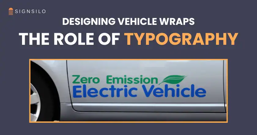
Industry experts now categorize vehicle wrap effectiveness based on the "three-second rule." This principle dictates that a passing motorist or pedestrian should be able to identify the brand name, the core service, and the contact method within a three-second window. This narrow timeframe has effectively penalized decorative scripts and low-contrast lettering, elevating clean, professional typography to a position of functional necessity.
A Chronology of Vehicle Signage Trends
The transition to typography-centric design can be traced through several distinct eras of commercial vehicle branding:
- The Era of Hand-Lettering (Pre-1980s): Before the advent of vinyl, vehicle signage was the domain of sign painters. This era was characterized by high-quality, though labor-intensive, typography. Legibility was paramount because every stroke cost time and money.
- The Early Vinyl and Decal Phase (1980s–1990s): The introduction of plotter-cut vinyl allowed for more consistent branding but limited designers to simple shapes and a few font choices.
- The Digital Printing Explosion (2000s–2010s): As wide-format digital printing became affordable, the "more is more" philosophy took hold. Vehicles were frequently covered in "wraps" featuring busy backgrounds, multiple font styles, and photographic elements that often obscured the actual marketing message.
- The Minimalist Typographic Revival (2020–Present): Contemporary design has returned to the roots of clarity. Modern wraps now prioritize white space, high-contrast color palettes, and "hero" typography that defines the brand’s personality through the weight and structure of the letterforms themselves.
Data-Driven Design: The Case for Legibility
Supporting data from the advertising industry suggests that the ROI of a vehicle wrap is directly tied to its "scanability." A study by the American Trucking Association (ATA) indicated that 91% of people noticed words and pictures on fleet vehicles, but the retention rate dropped significantly when the text was stylized beyond immediate recognition.

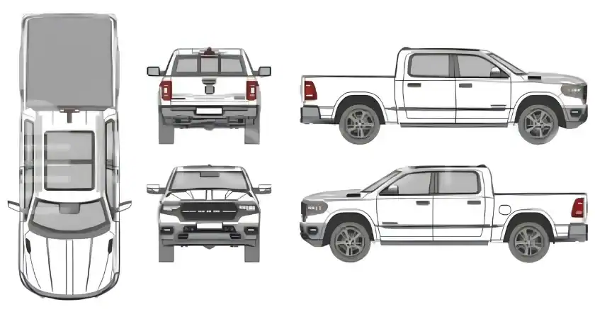
Furthermore, the physical environment of the vehicle introduces challenges that do not exist in traditional print. Body lines, door handles, sliding tracks, and rivets can distort text. Designers are now utilizing professional tools to mitigate these factors. For instance, the use of font tester files and vehicle templates has become standard practice. These tools allow designers to simulate how a specific typeface—whether a geometric sans-serif or a rugged slab-serif—will interact with the complex curves of a Ford Transit or a heavy-duty freight truck.
SignSilo and the Democratization of Professional Typography
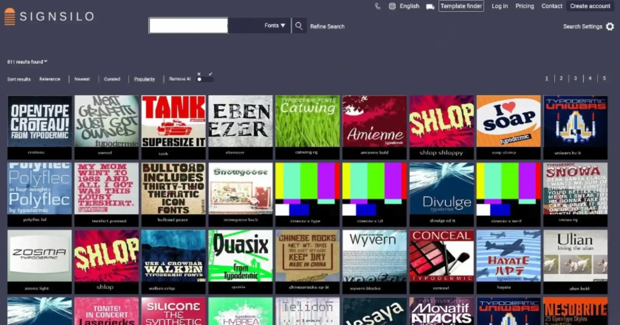
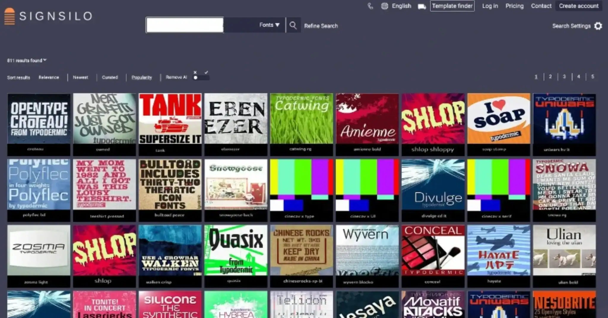
The shift toward typographic excellence has been facilitated by the emergence of specialized resources like SignSilo. For vehicle graphics professionals, the challenge is rarely a lack of fonts, but rather a lack of "road-ready" fonts. SignSilo’s extensive library of professional typefaces provides a curated selection specifically chosen for high-impact visibility.
A critical component of this modern workflow is the "tester file" system. Because a font that appears balanced on a 27-inch monitor may become illegible when scaled to six feet in length, professional designers now rely on these testers to evaluate "kerning" (the space between letters) and "x-height" (the height of lowercase letters). If the spacing is too tight, letters "blur" together at a distance; if the strokes are too thin, they vanish against the background color of the wrap. By testing these variables before production, designers can ensure that the final product maintains its integrity in real-world conditions.
Official Responses and Industry Perspectives
Leading figures in the vehicle graphics industry have voiced strong support for this "less is more" typographic movement. "We are seeing a move away from the ‘wrap everything’ mentality," states one lead designer at a national fleet branding agency. "Clients are beginning to understand that if a potential customer has to squint to read your phone number, the wrap has failed, regardless of how beautiful the artwork is. Typography is the only element that actually closes the sale on the road."
Fleet managers are also responding to the economic benefits of typographic simplicity. Cleaner designs are often faster to install and easier to repair. If a single panel of a vehicle is damaged in an accident, a design based on clean typography and solid colors is significantly easier to color-match and replace than a complex, multi-layered photographic wrap. This reduces "down-time" for commercial vehicles, directly impacting the company’s bottom line.
Typography as the Core of Brand Identity
Modern branding philosophy treats typography as a visual shorthand for a company’s values. In the absence of a long-form sales pitch, the choice of font does the heavy lifting:

- Bold Sans-Serifs: Communicate modernism, efficiency, and reliability. These are favored by technology and logistics firms.
- Heavy Slab-Serifs: Suggest durability, strength, and heritage. These are frequently employed by construction and heavy machinery industries.
- Geometric Typefaces: Offer a sense of approachability and cleanliness, ideal for service-based brands such as plumbing or HVAC companies.
By using typography as the primary design element, a brand can maintain consistency across a diverse fleet. A typographic system can be easily adapted from a small passenger car to a 53-foot trailer while maintaining the same visual impact, a feat that is much harder to achieve with complex illustrations.
Broader Impact and Future Implications
The rise of typography in vehicle design is not an isolated trend but part of a broader movement in communication design that favors "radical clarity." As the world becomes increasingly saturated with visual stimuli, the ability to deliver a clear, unadorned message is becoming a competitive advantage.
Looking forward, the integration of typography with emerging vehicle technologies—such as reflective vinyls that change appearance under different lighting or digital ink displays—will likely continue this evolution. However, the core principle remains unchanged: the vehicle is a vessel for information.
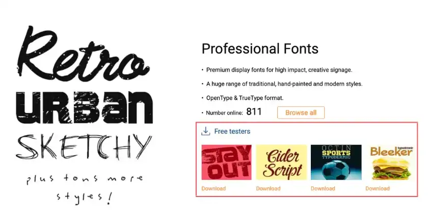
In conclusion, the professionalization of vehicle wrap design has reached a stage where the "star" of the show is no longer the complexity of the print, but the clarity of the word. By prioritizing high-quality fonts, utilizing rigorous testing tools like those provided by SignSilo, and adhering to the principles of legibility, designers are creating a new generation of fleet graphics that are as functional as they are aesthetically pleasing. For the modern business, the message is clear: in the race for consumer attention, the fastest font wins.