The landscape of mobile advertising has undergone a fundamental transformation, shifting from the era of "busy" graphics and photographic collages to a refined focus on typographic clarity. In the modern urban environment, where a branded vehicle may only be visible to a pedestrian or fellow driver for a matter of seconds, the ability of a design to communicate instantly has become the primary metric of its success. This evolution has elevated typography from a secondary design element to the central pillar of effective vehicle wrap strategy. Industry professionals are increasingly moving away from the elaborate scripts and decorative typefaces of the early 2000s in favor of clean, high-contrast, and highly legible fonts that prioritize functional communication over mere aesthetic decoration.
The Evolution of Vehicle Branding: A Chronological Perspective
To understand the current dominance of typography in vehicle wraps, it is necessary to examine the historical trajectory of mobile branding. The practice has evolved through several distinct phases, each defined by the technology and marketing philosophies of the time.
- The Pre-Vinyl Era (Early 1900s – 1970s): Branding was primarily achieved through hand-painted lettering. Sign painters focused on "block" or "casual" lettering styles that were inherently legible due to the physical limitations of the brush. Branding was localized and often limited to a simple company name and phone number on a door panel.
- The Introduction of Cut Vinyl (1980s – 1990s): The advent of plotter-cut vinyl allowed for more consistent branding across fleets. However, the technology limited designers to solid colors and basic shapes, which reinforced a typographic-heavy approach by necessity.
- The Digital Printing Revolution (2000s – 2015): The capability to print high-resolution images on large-format vinyl led to a period of "design excess." Many vehicle wraps during this era were cluttered with complex gradients, photographic backgrounds, and 3D effects, which often obscured the actual brand message.
- The Modern Minimalist Era (2016 – Present): As marketing saturation increased, the "less is more" philosophy took hold. Designers recognized that in a high-speed environment, visual noise is the enemy of retention. This has led back to a focus on typography, albeit with modern digital precision and sophisticated font selection.
The Psychology of Legibility and Movement
The core challenge of vehicle wrap design is the factor of movement. When a vehicle is stationary, a viewer has time to process intricate details. However, research in the field of outdoor advertising suggests that a moving vehicle has between 2.5 and 3 seconds to capture attention and convey a message. This "three-second rule" dictates that the hierarchy of information must be immediate.
Cognitive psychology plays a significant role in font selection for these environments. Sans-serif typefaces—such as Helvetica, Montserrat, or specialized geometric fonts—are processed faster by the human brain because they lack the "noise" of serifs (the small strokes at the ends of letters). In a high-speed context, the brain seeks patterns and familiar shapes. Professional designers now prioritize "x-height" (the height of lowercase letters) and "kerning" (the space between letters) to ensure that characters do not bleed together when viewed from a distance or at an angle.
Data-Driven Marketing: The ROI of Mobile Billboards
Supporting the shift toward better typography is the significant economic impact of vehicle branding. According to the Outdoor Advertising Association of America (OAAA), a single vehicle wrap can generate between 30,000 and 70,000 impressions daily, depending on the route and population density. Furthermore, mobile advertising is found to have a 97% recall rate among viewers, significantly higher than static billboards.

However, these impressions are only valuable if the brand is identifiable. Industry data suggests that wraps with poor typographic contrast or overly complex lettering suffer a "recognition drop" of up to 40%. This means that nearly half of the potential impressions are wasted if the viewer cannot read the company name or service within the initial window of visibility. This financial reality has forced fleet managers to move away from "artistic" wraps toward "communication-first" designs.
SignSilo and the Professionalization of Font Selection
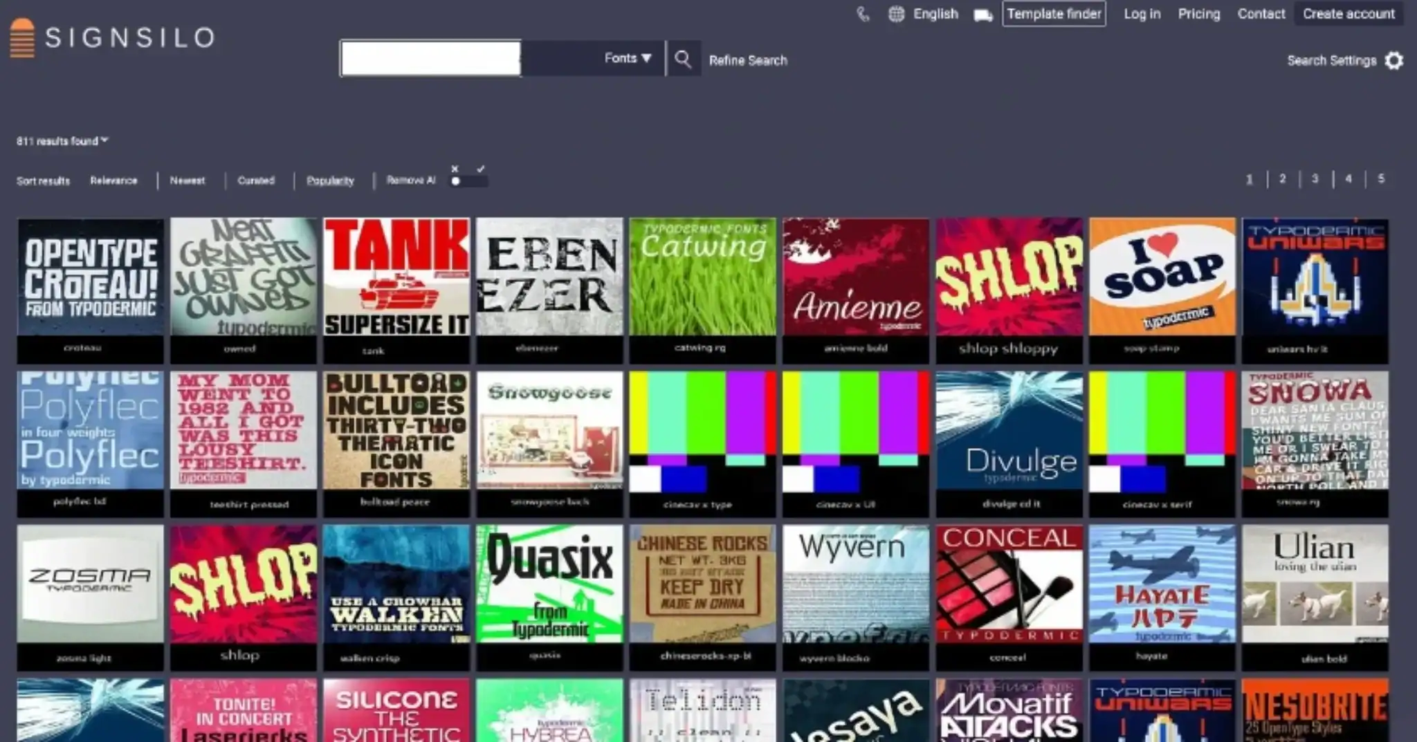
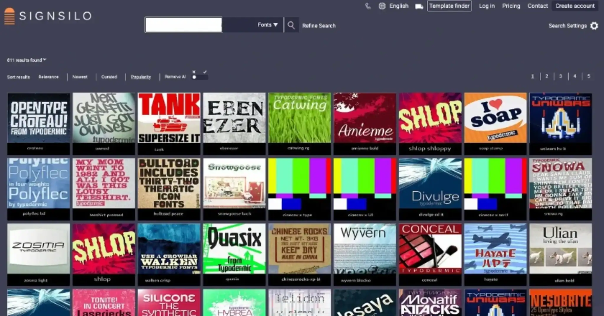
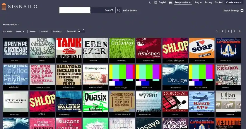
As typography has taken center stage, the tools used by designers have become more specialized. SignSilo, a prominent resource in the vehicle graphics industry, has responded to this trend by providing a curated library of professional fonts specifically optimized for large-format application. The challenge for a fleet designer is not just finding a "pretty" font, but finding one that maintains its integrity when scaled up several hundred percent.
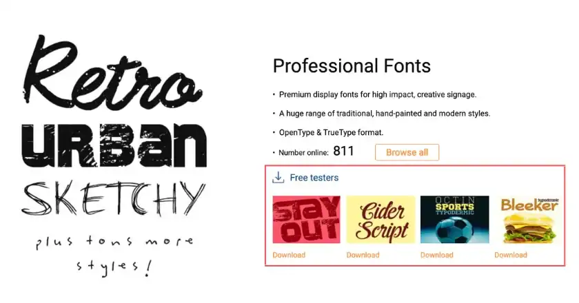
One of the most significant developments in this space is the use of font tester files. These allow designers to simulate how a typeface will look when applied to the complex curves and body panels of a vehicle. A font that appears balanced on a flat computer screen may become distorted when placed over a wheel well or a door handle. By testing weight, spacing, and proportions before the vinyl is printed, professionals can ensure that the brand’s personality—whether it is the efficiency of a tech firm or the ruggedness of a construction company—remains intact across the entire fleet.
Technical Considerations: Designing for the Road
The transition of typography from decoration to communication design requires a rigorous technical approach. Professional designers now evaluate several key factors:
Contrast and Color Theory
The relationship between the font color and the background color (the "wrap") is the most critical factor in legibility. High-contrast combinations, such as white text on a navy background or black text on a yellow background, provide the highest visibility. Designers are increasingly avoiding tone-on-tone effects or metallic fonts for essential information, as sun glare and road grime can render these unreadable.
Letter Spacing and Tracking
In traditional print design, tight tracking (spacing between letters) can create a modern, sleek look. In vehicle design, tight tracking is a liability. As a vehicle moves further away, letters tend to visually merge. Increasing the tracking slightly ensures that each character remains distinct, even at a distance of 50 to 100 feet.

Typographic Hierarchy
A successful wrap establishes a clear order of importance. Usually, the company name is the primary element, followed by the core service or "value proposition," and finally the contact information (website or QR code). Using different weights of the same font family—rather than multiple different fonts—creates a cohesive look that is easier for the eye to navigate.
Industry Perspectives: The Move Toward Minimalist Branding
Fleet managers and marketing directors are increasingly vocal about the need for simplified designs. "We realized that our previous wraps were trying to say too much," says a logistics manager for a regional delivery service. "We had photos of our trucks, photos of our drivers, and five different bullet points. When we switched to a bold, typographic-only design, we saw a noticeable increase in web traffic originating from ‘vehicle sightings.’"
This sentiment is echoed by graphic designers who specialize in "wayfinding" and environmental graphics. The consensus is that a vehicle should function like a sign, not a brochure. The typography is the brand’s "voice" on the road, and a clear voice is more memorable than a cluttered image.
Broader Impact and Future Implications
The shift toward typographic dominance in vehicle wraps is part of a larger trend in global branding toward "de-branding" or simplification. Major corporations like Google, Airbnb, and various automotive manufacturers have simplified their logos to sans-serif versions to ensure they work across all digital and physical platforms.
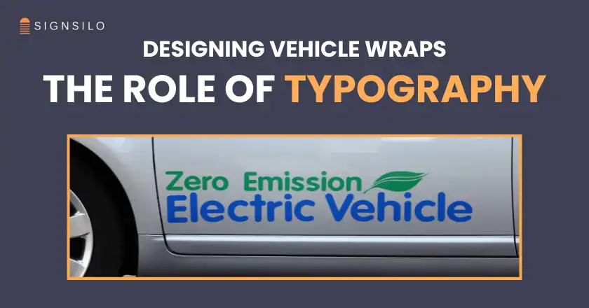
Looking forward, we can expect typography to become even more integrated with the vehicle’s form. New materials, such as reflective vinyl and textured films, are being used to make typography "pop" without the need for complex colors. Additionally, as electric vehicles (EVs) become more common in commercial fleets, their often smoother, more aerodynamic body panels provide a "cleaner canvas" for bold, architectural typography.
The "real star" of vehicle wrap design is no longer the high-resolution photo of a product; it is the carefully selected, perfectly spaced, and highly legible word. As urban environments become more visually crowded, the brands that stand out will be those that speak clearly, quickly, and with typographic authority. This transition marks the maturity of the vehicle wrap industry, moving from a novelty service to a sophisticated discipline of communication design. For the next generation of fleet graphics, the message is clear: if they can’t read it, they won’t remember it.