The Functional Evolution of Fleet Branding
Historically, vehicle graphics were limited by the technology of the era. In the early 20th century, hand-painted lettering was the standard, offering high legibility but requiring significant time and artisanal skill. The introduction of pressure-sensitive vinyl in the 1950s and the subsequent explosion of digital wide-format printing in the 1990s allowed designers to wrap entire vehicles in complex, high-resolution photographs. However, the industry is now seeing a "minimalist correction."
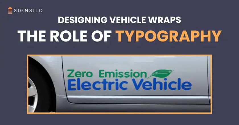
Designers have observed that overly "busy" wraps—those featuring multiple gradients, complex textures, and decorative scripts—often fail the most basic test of advertising: clear communication. As a result, typography has moved from a secondary consideration to the primary functional component of vehicle wrap design. The focus has pivoted toward clean, high-contrast, and highly legible fonts that ensure a brand’s identity is instantly recognizable, even at highway speeds.
Chronology of Vehicle Graphic Trends
To understand the current dominance of typography, it is essential to examine the evolution of the medium over the last several decades:
- The Era of Hand-Painting (Pre-1950s): Sign painters focused on "block" lettering and high-contrast colors (black on yellow or white on red) to ensure readability from a distance.
- The Decal Revolution (1960s–1980s): Die-cut vinyl letters became the industry standard. Designs were largely text-based and focused on the company name and phone number.
- The Full-Wrap Explosion (1990s–2010s): Advancements in digital printing allowed for "photo-realistic" wraps. This era was characterized by visual clutter, where typography was often buried under complex background images.
- The Typographic Renaissance (2020–Present): A return to clarity. Modern designers utilize sophisticated font families and strategic white space to create "clean" looks that prioritize the speed of information processing.
Data-Driven Design: The 3-Second Rule
The shift toward typographic focus is supported by significant data regarding consumer behavior and visual ergonomics. According to the Outdoor Advertising Association of America (OAAA), mobile billboards—which include vehicle wraps—can generate between 30,000 and 70,000 impressions daily depending on the route and population density. However, the "recall rate" of these impressions is heavily dependent on legibility.
Research into driver distraction and visual processing suggests that a viewer typically has a three-second window to register a mobile advertisement. In this timeframe, the human eye can process approximately five to seven words. Complex decorative fonts or scripts require more "cognitive load" to decipher, often leading the viewer to abandon the attempt to read the message. Conversely, sans-serif typefaces with open counters and consistent stroke weights allow for "glance-based" reading. This efficiency is why typography has become the focal point for fleet managers who view their vehicles as a high-yield investment in brand awareness.

The Role of Professional Asset Libraries and Testing
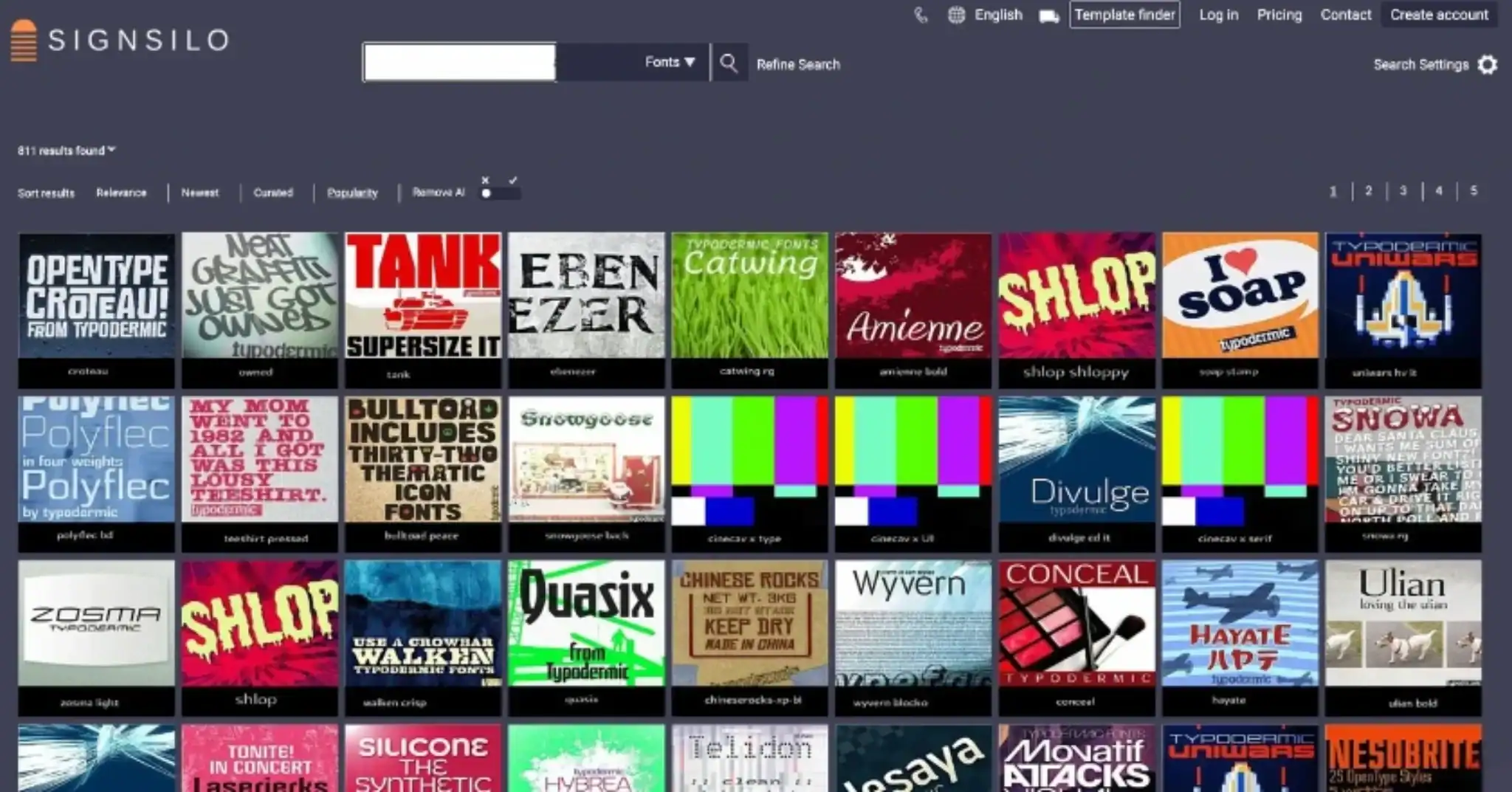
As typography takes center stage, the tools used to select and implement these fonts have become more specialized. Platforms like SignSilo have emerged as essential resources for the graphics industry, providing vast libraries of professional-grade fonts specifically curated for large-scale applications. The challenge for a designer is not just finding a "pretty" font, but finding one that maintains its integrity when scaled up 1,000% or when applied over the complex curves and rivets of a commercial van.
One of the most critical advancements in this field is the use of font tester files. These allow designers to simulate how a specific typeface will react to the physical geometry of a vehicle. A font that appears balanced on a 27-inch computer monitor may suffer from "kerning collapse" (where letters appear to run together) when viewed from 50 feet away on a moving truck. By testing weights, spacing, and proportions before the vinyl is printed, professionals can avoid costly production errors and ensure that the final product meets the client’s communication goals.
Inferred Industry Perspectives: The Designer’s Mandate
While official statements from major design houses vary, the consensus among fleet graphic specialists is that typography serves as the "voice" of the brand. A technology firm might utilize a geometric sans-serif to convey precision and modernity, while a luxury service provider might opt for a high-contrast serif to evoke tradition and elegance.
"The wrap is the handshake," notes a hypothetical industry veteran. "If the typography is messy or unreadable, the brand feels unreliable. If the type is crisp and the hierarchy is clear, the customer assumes the service will be equally professional." This psychological link between typographic clarity and brand trust is a primary driver behind the current design trends.
Technical Analysis of Legibility Factors
Several technical factors contribute to why certain typographic choices outperform others in the context of vehicle wraps:
- X-Height: Fonts with a large x-height (the height of lowercase letters) are generally easier to read from a distance because the lowercase characters appear larger relative to the capitals.
- Stroke Contrast: High-contrast fonts (those with very thick and very thin lines) can "break up" under certain lighting conditions or when viewed at an angle. Low-to-medium contrast fonts remain stable in various environments.
- Kerning and Tracking: On a moving vehicle, letters tend to "bleed" together visually. Designers often increase the tracking (overall letter spacing) of fleet graphics to maintain character definition.
- Color Contrast: The relationship between the text color and the wrap background is paramount. Data suggests that a 70% contrast brightness is the minimum requirement for high-speed legibility.
Broader Impact and Market Implications
The prioritization of typography has broader implications for the economy of fleet management. A well-designed typographic wrap is often more cost-effective than a full-color photographic wrap. It requires less ink, simplifies the printing process, and is often easier to repair if a single panel of the vehicle is damaged.

Furthermore, as urban environments become more visually saturated, "minimalist" vehicles stand out. In a sea of colorful, chaotic advertisements, a clean white van with bold, perfectly spaced black typography creates a "visual silence" that actually draws the eye more effectively than its louder counterparts. This "less is more" approach is becoming the gold standard for national franchises and local businesses alike.
Future Trends in Vehicle Typography
Looking forward, the industry is expected to see further integration of typography with digital elements. While QR codes have been attempted on vehicles, their utility is limited to stationary or slow-moving traffic. The next generation of wrap design will likely focus on "typographic icons"—where the company name is stylized so uniquely that the text itself becomes the logo.
Additionally, as electric vehicle (EV) fleets grow, designers are experimenting with "aerodynamic" typography—fonts that visually mimic the sleek, futuristic lines of modern EVs. Regardless of the vehicle’s shape or power source, the fundamental principle remains: if the viewer cannot read the message in the time it takes to change lanes, the design has failed. By placing typography at the heart of the design process, the vehicle wrap industry is ensuring that its "stars" are not just seen, but understood.