The Evolution of Mobile Advertising: From Paint to Precision Typography
The history of vehicle branding is a narrative of technological advancement and shifting aesthetic values. In the early 20th century, hand-painted lettering was the only option for businesses wishing to brand their delivery wagons and trucks. These designs were often simple due to the labor-intensive nature of the work. The advent of die-cut vinyl in the 1980s and 1990s allowed for more precision, but it was the "wrap revolution" of the early 2000s—fueled by large-format digital printing—that changed everything.
During the first two decades of the 2000s, designers often succumbed to the "everything and the kitchen sink" approach. Because digital printing allowed for unlimited colors and complex imagery, many fleet wraps became cluttered with gradients, high-resolution photos, and overlapping textures. However, as the novelty of full-vehicle wraps wore off, market data began to show a decline in brand recall for overly busy designs. Industry analysis suggested that while people noticed the "bright colors," they often failed to remember the company name or the service provided.
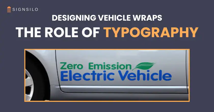
By 2020, the industry began a "minimalist revolution." The focus shifted toward high-contrast, typography-centric designs that prioritize instant legibility. Today, the design community acknowledges that a vehicle is not a stationary billboard or a magazine ad; it is a moving object that must communicate its message in a high-distraction environment.
The Science of Legibility: Data-Driven Design for the Road
Professional fleet designers now utilize specific metrics to ensure their typographic choices are effective. The core challenge is the "speed-to-read" ratio. According to transportation safety and advertising studies, a driver or pedestrian typically has between 2.5 and 3.5 seconds to process a passing vehicle’s message.
Supporting data suggests that for every 10 feet of viewing distance, a letter should be at least one inch tall to be legible. For a vehicle traveling at highway speeds, this requirement increases significantly. Designers must also account for the "vibration factor" and the visual noise of the surrounding traffic.
Key technical factors currently influencing typography in vehicle wraps include:
- Contrast Ratios: The most legible combinations remain black on yellow or white on dark blue. Designers are moving away from "tone-on-tone" typography, which may look sophisticated in a studio but disappears entirely on a rainy highway.
- X-Height and Kerning: Fonts with a large x-height (the height of lowercase letters) are preferred because they appear larger at a distance. Furthermore, "loose" kerning—the space between individual letters—is essential. When letters are too close together, they "bleed" into one another when viewed from a distance or while in motion, a phenomenon known as character crowding.
- Stroke Weight: Extremely thin fonts (hairline serifs) are becoming obsolete in fleet design. If a stroke is too thin, it can be "eaten" by the background color or become invisible under certain lighting conditions.
SignSilo and the Professionalization of Typographic Selection
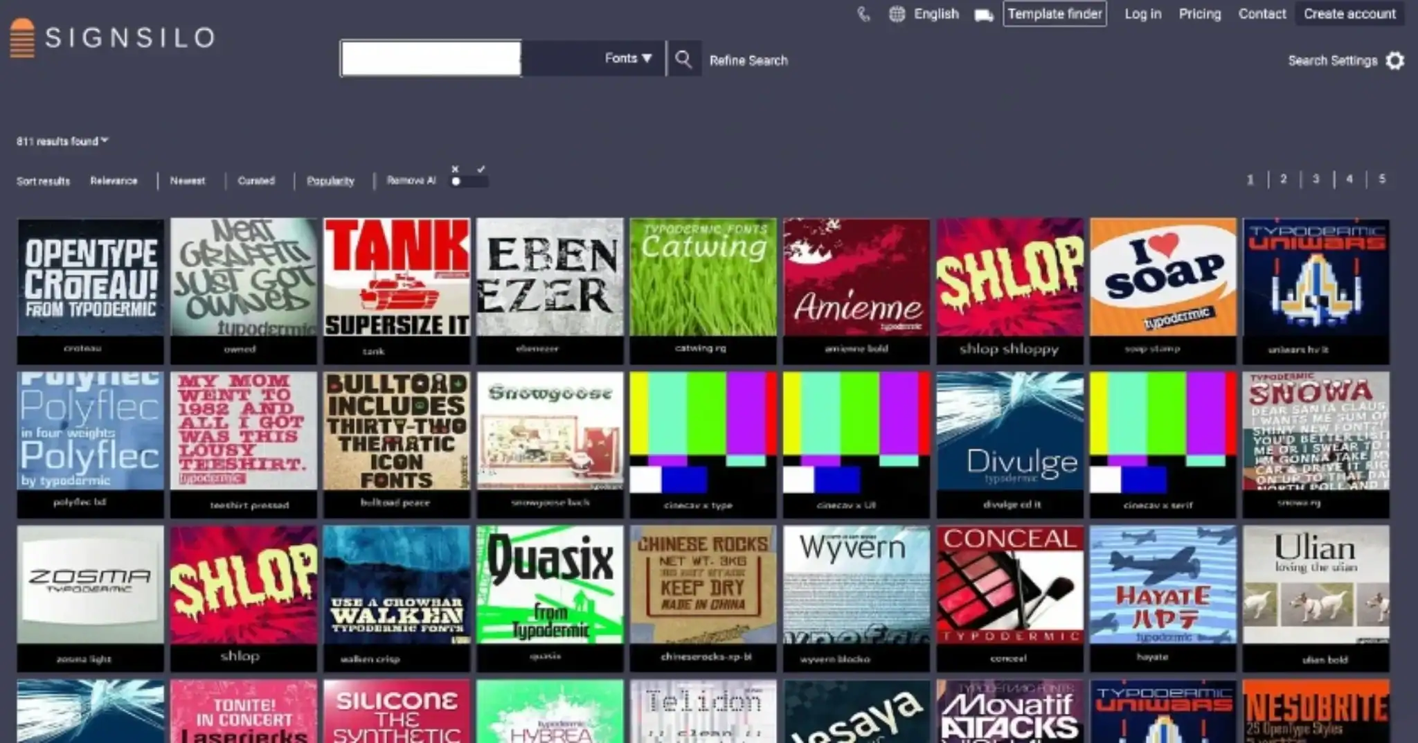
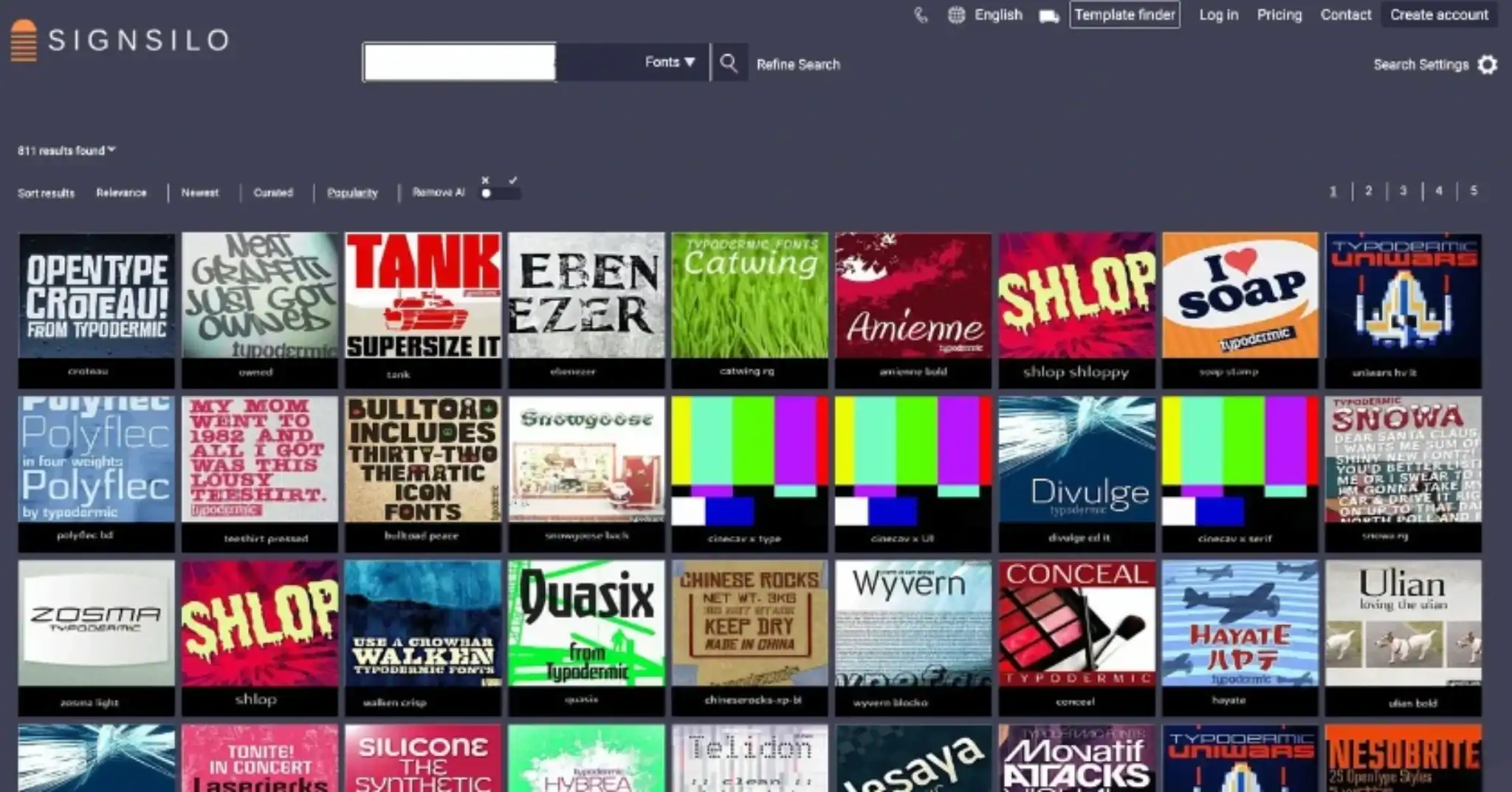
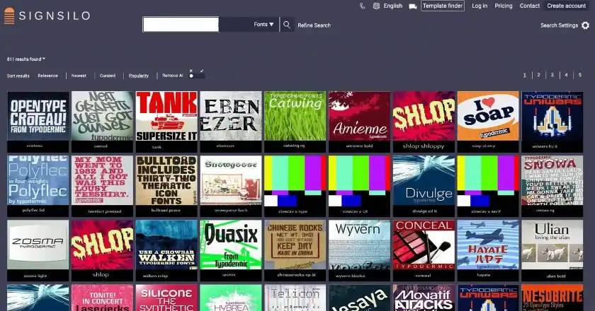
As typography has taken center stage, the tools available to designers have become more specialized. Platforms like SignSilo have emerged as critical resources, providing vast libraries of professional fonts specifically curated for the signage and vehicle wrap industries. Unlike standard web or print fonts, these typefaces are often designed with high-impact visibility in mind.

The role of SignSilo and similar professional repositories is not merely to provide aesthetic variety but to offer functional solutions. Their library includes clean, contemporary sans-serifs that communicate efficiency, as well as heavy-duty slab serifs that project strength and reliability for construction and industrial fleets.
One of the most significant advancements in the design workflow is the use of font tester files. Because a vehicle is a three-dimensional object with curves, rivets, and body panels, a font that looks balanced on a flat monitor can become distorted when applied to a van’s contoured side. Professional designers now use these testers to "pre-flight" their typography on 3D vehicle templates. This allows them to see how a company’s phone number or URL will look when it crosses a door handle or a sliding door track, ensuring that the message remains unbroken and readable.
The Psychological Impact of Font Personality
Beyond simple legibility, typography serves as the "voice" of the brand. In the absence of large illustrations, the font itself must convey the brand’s values.
- Modern Sans-Serifs: Tech companies and modern service providers often opt for geometric sans-serifs. These fonts communicate speed, innovation, and a "frictionless" customer experience.
- Bold Slab Serifs: For trade industries like plumbing, HVAC, or construction, bold slab serifs are the standard. These fonts imply durability, tradition, and physical strength.
- Humanist Typefaces: For healthcare or community-based services, softer, more organic typefaces are used to appear approachable and empathetic.
The industry has seen a marked move away from "novelty" fonts—such as those mimicking handwriting or brush strokes—except in very specific boutique branding cases. The consensus among top-tier wrap shops is that if a font takes more than a fraction of a second to "decode," it is a liability to the client’s Return on Investment (ROI).
Designing for Movement: The Ultimate Litmus Test
The most critical distinction in modern fleet design is the "Static vs. Kinetic" perspective. A vehicle wrap must perform two different jobs. When parked (static), it can afford to show more detail, such as a list of services or a QR code. However, when the vehicle is in motion (kinetic), the typography must be the "hero."
Professional responses to this challenge involve creating a "typographic hierarchy." The company name is given the highest priority and the largest scale. Secondary information, such as the "Call to Action" (CTA), is placed in a contrasting weight or color. Designers are increasingly advising clients to strip away unnecessary text. The "less is more" philosophy is no longer just an aesthetic choice; it is a strategic necessity. A vehicle with three words in a massive, clear font will generate more leads than a vehicle with thirty words in a small, decorative font.
Broader Impact and Industry Implications
The shift toward typography-led design has several broader implications for the marketing and vehicle wrap industries. First, it has lowered the barrier to entry for clean, professional-looking designs, but it has raised the bar for "design intelligence." Anyone can put a photo on a van, but it takes a specialist to understand the mathematical relationship between font size, vehicle speed, and viewer retention.
Second, there is an economic benefit. Typography-heavy designs often require less ink and are easier to patch or repair than complex photographic wraps. If a vehicle is involved in a minor collision, replacing a single door panel with a few lines of text is significantly cheaper and faster than trying to color-match a complex gradient or a high-resolution image of a landscape.

Furthermore, as autonomous vehicles and "smart cities" evolve, the way we interact with mobile branding may change, but the need for instant communication will remain. Some industry analysts predict that we will see a rise in "dynamic" or "digital" wraps using E-ink technology, which would allow typography to change based on the vehicle’s location or the time of day. Even in such a high-tech future, the fundamental principles of typography—contrast, scale, and legibility—will remain the foundation of the medium.
Conclusion: The Future of the "Moving Message"
Why typography has become the real star of vehicle wrap design is ultimately a matter of utility. In an era of information overload, the most successful brands are those that can simplify their message. For a service vehicle on a crowded city street, the "message" is the company’s identity and how to reach them.
By prioritizing clean, purposeful typography and utilizing professional tools like SignSilo to test and refine these designs, the next generation of fleet graphics will be more effective, more durable, and more memorable. The industry is moving toward a future where the vehicle is no longer just a canvas for art, but a high-performance tool for communication. For the modern fleet designer, the question is no longer how much can be added to a wrap, but how much can be stripped away until only the perfect, most readable message remains.