

Every photographer, regardless of skill level, inevitably encounters images that are technically sound—perfectly exposed, sharply focused, and well-composed—yet somehow lack that elusive spark, that compelling visual magnetism that elevates a photograph from merely good to truly unforgettable. This phenomenon, often described as a photo "falling flat" or feeling "unfinished," highlights a critical truth in digital imaging: the difference between a decent capture and a breathtaking one frequently hinges on a series of subtle, yet meticulously applied, finishing touches. These are the adjustments that breathe life, emotion, and depth into an otherwise sterile digital file, transforming it into a piece of art that resonates with the viewer.
The journey of an image from raw data to final presentation is a multi-faceted process that has evolved dramatically over the decades. Historically, photographers manipulated light and chemicals in darkrooms, a craft demanding immense skill and foresight. With the advent of digital photography and sophisticated software, the "darkroom" moved to the desktop, offering unprecedented control. However, this power also introduced complexity, particularly in the realm of color management and tonal refinement. Early digital editing tools, while revolutionary, often required intricate manual adjustments, making nuanced color grading a steep learning curve for many. The challenge remained: how to achieve professional-grade color harmony without years of dedicated study in color science and artistic theory.
Enter tools like Luminar Neo, developed by Skylum, which represent the cutting edge of AI-powered photo editing. Luminar Neo has gained significant traction in the photography community for its innovative approach to simplifying complex tasks through artificial intelligence, making advanced editing techniques accessible to a broader audience. While many users are familiar with its headline-grabbing AI features for sky replacement or portrait enhancement, there exists a powerful, yet frequently overlooked, capability nestled within its Professional Tools section: Color Harmony. This feature, designed with an intuitive interface, offers photographers an unprecedented degree of control over tone, contrast, and overall color balance, providing the precise instruments needed to infuse that missing vitality into an image. It’s not about drastic, heavy-handed transformations, but rather about introducing nuanced refinements that subtly guide the viewer’s eye, emphasize the subject, and cultivate a cohesive emotional atmosphere that perfectly aligns with the scene’s inherent mood and lighting conditions.
The Nuance of Visual Storytelling: Beyond Technical Perfection

The pursuit of technical perfection in photography – nailing exposure, achieving tack-sharp focus, and adhering to compositional rules – is foundational. However, an image’s true power often lies in its ability to evoke emotion, tell a story, or convey a specific atmosphere. A photograph of a serene landscape, for instance, might be technically impeccable, but without careful color grading, it could feel sterile, failing to capture the tranquil majesty of the scene. Similarly, a portrait, despite being perfectly lit, might lack the warmth or intimacy required to truly connect with the viewer if its colors are flat or unbalanced.
This gap between technical accuracy and emotional resonance is where advanced color tools become indispensable. Color is inherently tied to human perception and emotion; warm tones often convey comfort, energy, or passion, while cool tones can suggest tranquility, melancholy, or vastness. The interplay of these colors, their saturation, luminance, and contrast, forms the bedrock of visual storytelling. Before the widespread adoption of AI in photo editing, achieving sophisticated color harmony often meant hours spent meticulously adjusting curves, hue/saturation sliders, and color balance wheels in complex software, a process that could be intimidating and time-consuming. Skylum’s development of Color Harmony within Luminar Neo specifically addresses this challenge, aiming to democratize access to professional-level color grading without sacrificing creative control.
Color Harmony: Unveiling a Hidden Powerhouse
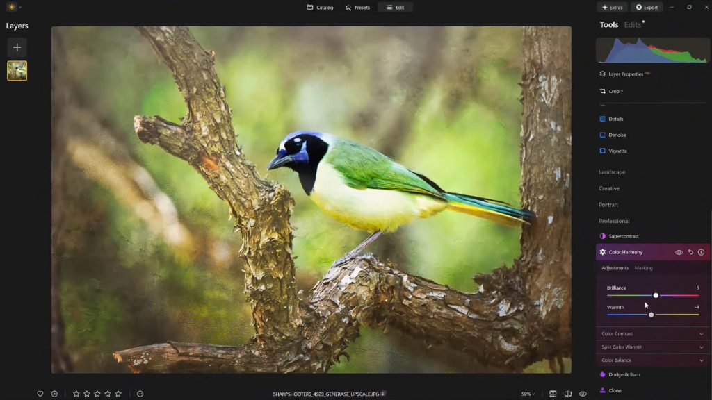
Luminar Neo’s Color Harmony tool, while perhaps not as prominently advertised as some of its AI counterparts, represents a significant leap in intuitive color management. Its placement within the "Professional Tools" section might lead some casual users to bypass it, assuming it’s reserved for expert-level adjustments. However, once understood, its capabilities quickly become an essential part of any refined editing workflow. This tool is not about applying pre-packaged filters; it’s about providing granular control over the subtle relationships between colors, allowing photographers to sculpt the visual narrative with precision.
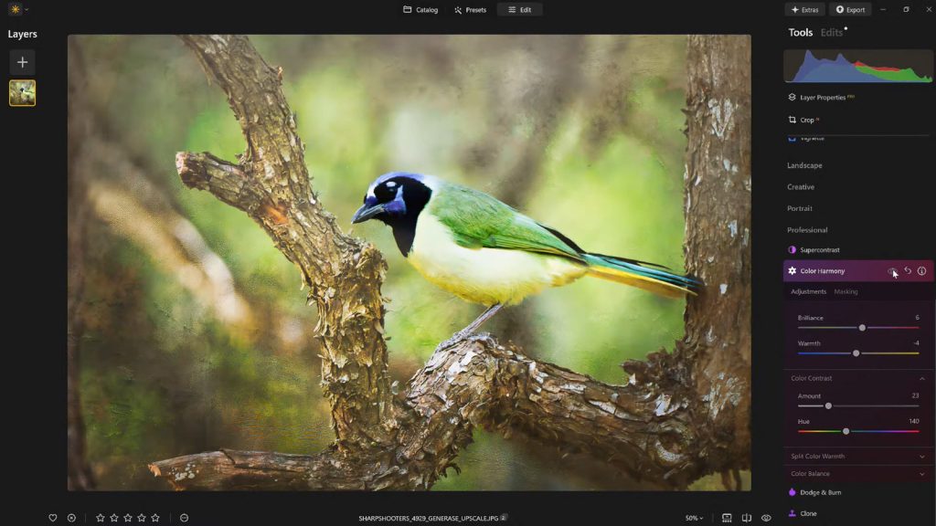
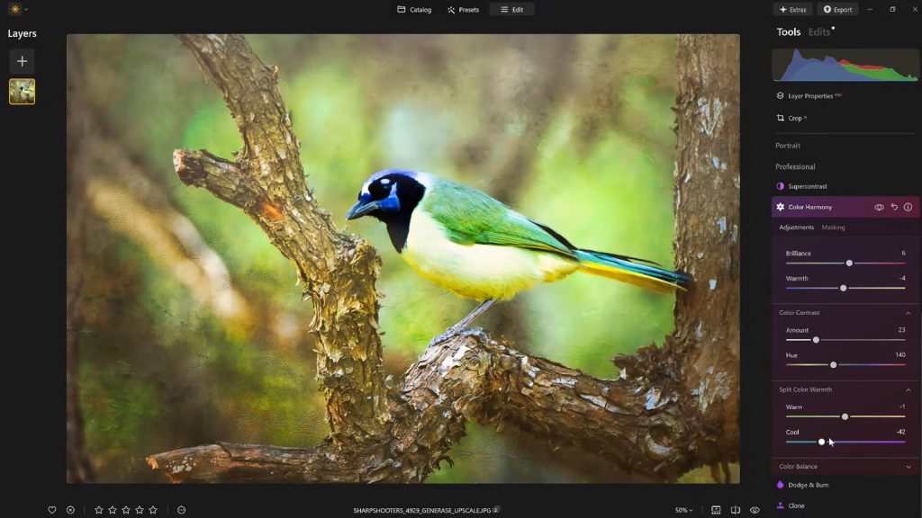
The tool offers a suite of interconnected adjustments: Brilliance, Warmth, Color Contrast, Split Warmth, and Color Balance. Each slider, meticulously engineered, works in concert to empower the photographer to fine-tune the image. The beauty of Color Harmony lies in its ability to introduce these nuanced controls, moving beyond the blunt instruments of global saturation or temperature adjustments. It understands that color is a complex, multi-dimensional element, and true mastery comes from the ability to manipulate its various facets independently yet harmoniously.

Deconstructing Color Harmony: A Deep Dive into its Controls
To fully appreciate the transformative potential of Color Harmony, it’s crucial to understand the function and application of each of its components.
Brilliance and Warmth: Crafting the Emotional Core
- Brilliance: Unlike a standard saturation slider, which globally intensifies all colors and can often lead to an artificial, oversaturated look, Brilliance offers a more refined approach. Small adjustments to Brilliance subtly increase or decrease the vibrance of colors, enhancing their richness without pushing them into garish territory. A slight boost can make hues appear more luminous and alive, adding a perceived depth and clarity to the image. Conversely, reducing brilliance can create a softer, more subdued palette. The key, as with many advanced tools, is a delicate touch; overdoing Brilliance can quickly lead to an unnatural, almost cartoonish effect. The power here lies in its ability to enhance the innate vibrancy of colors while meticulously preserving natural detail and avoiding harsh transitions.
- Warmth: This slider operates on the foundational principle of color temperature, allowing precise control over the overall warmth or coolness of an image. Shifting the slider to the right introduces a golden, sun-kissed glow, evoking feelings of comfort, nostalgia, or intensity, often ideal for sunset landscapes or cozy portraits. Moving it to the left cools the image down, imbuing it with a sense of calm, crispness, or even melancholy, suitable for winter scenes or dramatic skies. The psychological impact of warmth and coolness is profound; a subtle shift can dramatically alter the emotional tone of a photograph. Matching the warmth to the desired emotional resonance of the photo is paramount, ensuring that the atmosphere is enhanced rather than distorted. For instance, a portrait shot indoors might benefit from a slight increase in warmth to counter harsh artificial lighting, making skin tones appear healthier and more inviting.
Color Contrast and Split Warmth: Precision in Tonal Separation
- Color Contrast: This adjustment focuses on increasing the visual tension and separation between different color ranges, particularly emphasizing the distinction between highlights and shadows. It’s distinct from traditional contrast, which primarily manipulates luminance values. Color Contrast intelligently enhances the vibrancy and distinctness of opposing colors, making elements within the image pop and adding a palpable sense of depth. When applied judiciously, it can make a green forest appear lusher against a blue sky, or a warm-toned subject stand out more prominently against a cooler background. This selective enhancement of color differences creates a dynamic visual interest without the risk of over-processing or introducing artificial halos often associated with heavy global contrast adjustments. It’s a tool for sculpting the perception of three-dimensionality within a two-dimensional image.
- Split Warmth: This is a more specialized, yet incredibly potent, control. Split Warmth provides highly specific manipulation over the warm and cool tones independently. Unlike the global Warmth slider, which applies an effect across the entire image, Split Warmth allows photographers to selectively introduce warmth into one tonal range (e.g., highlights) while simultaneously cooling another (e.g., shadows), or vice-versa. This is particularly invaluable for tackling complex lighting scenarios, such as images captured during the "golden hour" where strong warm light meets deep cool shadows, or for creating deliberate color separation in layered compositions. For instance, one could introduce a subtle golden glow into the highlights of a landscape to emphasize the setting sun, while simultaneously adding a touch of cool blue to the shadows to enhance the perception of depth and atmosphere. While not always necessary for every image, Split Warmth becomes an indispensable asset for photographers aiming for sophisticated color grading and a distinctive artistic style, offering a level of control previously reserved for advanced colorists using high-end software.
Color Balance: Mastering the Tonal Range

Color Balance within Luminar Neo takes the concept of selective color adjustment to another level by offering independent control over the color tones present in shadows, midtones, and highlights. This tripartite division allows for incredibly targeted and precise adjustments that can profoundly impact the atmosphere and consistency of an image.
- Shadows: Manipulating the color balance in the shadows can rescue detail from deep, undifferentiated dark areas or introduce a subtle color cast to enhance mood. For example, adding a touch of blue to shadows can create a moody, mysterious feel, while a hint of green might evoke a vintage aesthetic.
- Midtones: Adjustments to midtones often have the most significant impact on the overall perceived color of an image, as this range represents the majority of an image’s tonal information. Shifting midtones slightly towards warmer or cooler hues can instantly make a landscape feel more inviting or a portrait appear more neutral and true-to-life. It’s a powerful lever for establishing the dominant color cast of a photograph.
- Highlights: Modifying the color balance in the highlights can soften harsh light, introduce atmospheric glows, or correct unwanted color shifts in bright areas. A touch of warmth in highlights can simulate a sun flare, while a subtle cool shift can make clouds appear more ethereal.
This independent control across the tonal spectrum makes Color Balance an advanced, yet remarkably intuitive, tool. Once a photographer grasps its potential, it becomes indispensable for achieving consistent color grading across an entire photo set, ensuring a cohesive look and feel whether for a client project, a personal series, or a social media feed. Professional photographers often leverage this tool to establish unique color grades that become part of their signature style, creating visual consistency that reinforces their brand identity.
The Art of Focus: Guiding the Viewer with Vignettes
Once the intricate dance of color adjustments is complete, the final step in refining an image often involves subtly directing the viewer’s attention. This is where the classic technique of vignetting finds its modern application. A vignette, traditionally a darkening of the image edges, serves as a powerful compositional tool that, when used thoughtfully, can draw the eye inward towards the main subject without the need for heavy masking or complex local adjustments.
Luminar Neo’s approach to vignetting is sophisticated, offering control not just over the darkness of the edges but also incorporating an "Inner Light" feature. By darkening the periphery of the frame while simultaneously introducing a gentle brightening or emphasis towards the center, the composition naturally pulls the viewer’s gaze towards the focal point. This creates a visual spotlight, enhancing focus and reinforcing the subject’s prominence within the frame.
The effectiveness of vignetting lies in its subtlety. A heavy, obvious vignette can feel dated or artificial. However, a carefully applied vignette, where the transition from dark to light is smooth and imperceptible, acts as a quiet but powerful storytelling device. It can frame a subject, isolate an emotion, or simply enhance the overall mood by creating a sense of depth and enclosure. It’s a tool that enhances the narrative without drawing attention to itself, becoming an integral part of the image’s emotional and compositional structure.
Streamlining Workflow: The Power of Presets in Professional Practice
In the fast-paced world of digital photography, efficiency and consistency are paramount, particularly for professionals handling large volumes of images. After investing time and artistic judgment into dialing in the perfect look for a photograph using tools like Color Harmony and vignetting, the ability to save these adjustments as a custom preset is not merely a convenience; it’s a strategic advantage.
Saving a custom preset in Luminar Neo ensures a consistent editing style across a series of images, which is critical for maintaining brand identity for clients or personal projects. Beyond consistency, presets dramatically accelerate the workflow. Reapplying a saved preset to other images in the same series, or even to similar images from different shoots, provides an instant baseline for future edits. This eliminates the need to meticulously replicate each adjustment from scratch, freeing up valuable time for other creative tasks or client interactions.
Furthermore, the preset workflow facilitates an essential aspect of professional editing: the iterative process. After an intense editing session, it’s common for photographers to experience "editor’s fatigue," leading to potential over-editing. By saving a preset, one can step away from the image, take a break, and then return with fresh eyes. Upon revisiting, areas where the edit might have gone too far become apparent. With a saved preset, the effect can be reapplied at a reduced strength (e.g., 70-80%), maintaining the core aesthetic while easing any excessive adjustments. This iterative approach, supported by robust preset management, ensures that the final image is not only consistent but also perfectly balanced and refined.
Broader Implications for Photographers and the Industry
The emergence of intuitive yet powerful tools like Color Harmony within Luminar Neo has significant implications for both individual photographers and the broader photography industry.
- Accessibility and Empowerment: By simplifying complex color grading techniques, Luminar Neo democratizes access to professional-level finishing touches. Hobbyists and aspiring professionals can now achieve results that once required extensive knowledge of color theory and advanced software. This empowerment fosters creativity and encourages more individuals to explore the artistic potential of post-processing.
- Efficiency and Creative Freedom: For seasoned professionals, these tools translate into increased efficiency. What once took hours of manual adjustment can now be achieved in minutes, allowing more time for shooting, client interaction, or further creative exploration. The AI-driven assistance doesn’t replace artistic vision but rather augments it, acting as a powerful co-pilot in the creative journey.
- The Evolving Landscape of Post-Processing: The trend towards intelligent, intuitive tools is set to continue. As AI algorithms become more sophisticated, photo editing software will likely offer even more granular control with less manual input, continually pushing the boundaries of what’s possible for photographers of all levels. Skylum’s commitment to developing features like Color Harmony underscores a broader industry movement towards making powerful tools more approachable, bridging the gap between cutting-edge technology and artistic expression.
Skylum’s Vision: Democratizing Advanced Editing
Skylum, the developer behind Luminar Neo, has consistently articulated a vision centered on democratizing advanced photo editing. Their philosophy is to empower photographers to achieve stunning results without being bogged down by technical complexities. The Color Harmony tool is a testament to this vision, offering precise control over critical elements of an image’s aesthetic without demanding a steep learning curve. Industry experts often highlight the importance of intuitive interfaces in modern software, and Luminar Neo’s design aligns perfectly with this, allowing creative individuals to focus on their artistic intent rather than wrestling with convoluted menus and sliders. User feedback trends indicate a strong demand for tools that offer both power and simplicity, and features like Color Harmony effectively address this market need.
A Finishing Touch That Matters
In conclusion, what truly distinguishes a compelling image from a merely acceptable one is rarely a dramatic, single-button transformation. Instead, it is the cumulative effect of a handful of carefully considered enhancements. Luminar Neo’s Color Harmony, when combined with subtle vignetting and a thoughtful, iterative editing approach, provides the essential toolkit for adding depth, emotion, and cohesion to any photograph. For photographers striving to imbue their work with that final, professional polish without resorting to over-processing, these finishing tools offer an optimal balance of precise control and creative freedom. They empower users to transcend technical correctness and craft images that genuinely resonate, ensuring that every shot tells its story with maximum impact.
For those eager to explore these transformative capabilities, Luminar Neo offers an accessible pathway. As a special incentive, readers can get 10% off Luminar Neo with the code NATURETTL at checkout, making it easier to unlock the full potential of their photography.
About the Author
Vanelli is an accomplished photographer, educator, and author based in Florida, serving as the Director of Education at Skylum. His diverse background includes a prior career as a Triple Crown Karate champion, a discipline that instilled in him a focus and precision now channeled into teaching visual arts. Vanelli is renowned for developing comprehensive educational content and courses for photo editing, frequently instructing industry leaders and shaping contemporary digital photography practices. A sought-after speaker, he delivers engaging presentations on various photography topics at major conferences worldwide. His extensive contributions to the field include a prolific output of articles, insightful educational videos, and hosting the widely acclaimed Luminar Coffee Break show, all aimed at empowering photographers to master their craft.