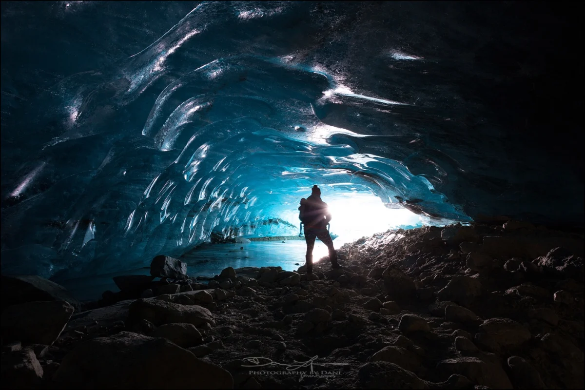
Every photographer, from the seasoned professional to the aspiring enthusiast, invariably encounters images that, despite meeting all technical benchmarks—correct exposure, sharp focus, and a well-composed frame—somehow lack that intangible spark. These photographs, while perfectly functional, often feel incomplete, failing to resonate with the intended emotional depth or visual impact. The crucial distinction between a merely decent shot and a truly stunning one frequently hinges on the application of subtle, yet meticulously executed, finishing touches. In an increasingly competitive visual landscape, where captivating imagery is paramount, the ability to imbue photographs with this missing life has become a highly sought-after skill, driving innovation in post-processing software.
Luminar Neo, a prominent name in the realm of AI-powered photo editing, offers a powerful yet frequently overlooked feature designed precisely to bridge this gap: Color Harmony. Positioned within the software’s Professional Tools section, its understated presence means it can be easily missed by users navigating the extensive array of features. However, for those who uncover its capabilities and master its application, Color Harmony rapidly transforms into an indispensable asset for the precise refinement of tone, contrast, and overall color balance, elevating images from good to exceptional. The development of such tools reflects a broader industry trend towards democratizing advanced editing techniques, making them accessible to a wider audience without compromising on professional-grade results.
The Evolution of Image Enhancement and Skylum’s Contribution

The journey of image enhancement has been a long and transformative one, originating from the chemical baths and darkroom manipulations of analog photography to the sophisticated digital algorithms of today. Early digital editing software, while revolutionary, often required extensive manual input and a deep understanding of complex color theory. Over time, the demand for more intuitive and efficient workflows led to the integration of automated features and, more recently, artificial intelligence. Companies like Skylum have been at the forefront of this evolution, striving to create tools that simplify intricate processes while providing powerful creative control. Luminar Neo, with its AI-driven engine, exemplifies this philosophy, aiming to reduce the learning curve for advanced editing techniques and empower photographers to focus more on their artistic vision.
The introduction of features like Color Harmony within Luminar Neo is a testament to this ongoing commitment. It acknowledges that while basic adjustments like exposure and saturation are fundamental, the true artistry often lies in the nuanced interplay of colors and tones. The tool is not merely an aggregator of existing sliders; rather, it represents a curated approach to managing the aesthetic coherence of an image, reflecting years of research into photographic principles and user experience. Skylum’s Director of Education, Vanelli, a notable figure in the photography education space, frequently emphasizes the importance of these ‘finishing touches’ in his workshops and online content, underscoring the company’s dedication to equipping photographers with the knowledge to fully leverage their software.
Color Harmony: A Gateway to Nuanced Control
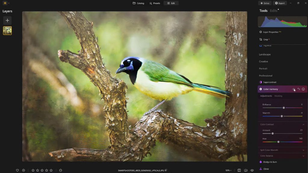
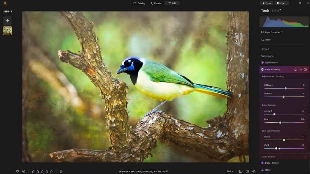
Unlike many editing tools that aim for drastic, immediate transformations, Color Harmony operates with a philosophy of subtlety and precision. Its core strength lies in its ability to introduce nuanced control over how colors interact and influence each other across an entire image. This approach allows photographers to sculpt the visual narrative of their work, guiding the viewer’s eye and enhancing the emotional impact without resorting to overt or artificial-looking alterations. The tool suite comprises several distinct adjustments: Brilliance, Warmth, Color Contrast, Split Warmth, and Color Balance. Each component is engineered to provide granular control, enabling photographers to fine-tune their work with a level of precision that was once the exclusive domain of highly skilled retouchers.

The strategic design of Color Harmony ensures that each section can be used independently or in conjunction with others, creating a symbiotic relationship that contributes to a cohesive final image. This synergy is crucial for achieving an overall feel that is perfectly suited to the mood, lighting, and narrative context of the scene. The global photography community has increasingly recognized the importance of such integrated tools, as evidenced by discussions in online forums and professional workshops that highlight the impact of holistic color grading on portfolio quality.
Brilliance and Warmth: The Art of Gentle Refinement
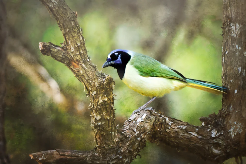
Beginning with Brilliance, this adjustment offers a refined alternative to standard saturation controls. While basic saturation sliders often lead to harsh, oversaturated colors when pushed too far, Brilliance allows for an increase or decrease in vibrance with a more natural, subtle effect. A slight boost can infuse colors with a richer, more profound tone, enhancing their depth and luminosity while meticulously preserving fine details and preventing the image from appearing artificial. Conversely, excessive application can still push the image into an unnatural aesthetic, underscoring the principle that a light, judicious touch typically yields the most impactful and aesthetically pleasing results. This careful balance is critical for maintaining the authenticity of the captured scene.
Similarly, Warmth operates on a philosophy of gentle influence rather than aggressive alteration. Moving the slider to the right introduces a soft, golden glow, evoking feelings of comfort, nostalgia, or the golden hour’s ethereal quality. Shifting it to the left, conversely, cools the image, lending it a serene, dramatic, or even somber mood. The artistry in using Warmth lies in its careful calibration to match the inherent emotional tone and ambient lighting of the photograph. Subtle adjustments can profoundly affect the perception of depth and atmosphere, enriching the narrative without overwhelming the viewer with an unnatural color cast. For instance, a landscape photograph taken at dawn might benefit from a gentle increase in warmth to emphasize the emerging sunlight, while a portrait shot in overcast conditions might require a slight cooling to achieve a neutral, balanced skin tone.

Mastering Color Contrast and Split Warmth for Depth and Separation
Color Contrast serves as a sophisticated mechanism for increasing the visual tension and separation between distinct color ranges within an image, particularly pronounced between highlights and shadows. When applied with deliberation and artistic intent, this tool does not merely boost contrast globally but enhances the perceived depth, making elements within the photograph stand out more distinctly without introducing the harshness often associated with conventional contrast adjustments. This selective enhancement contributes significantly to the image’s three-dimensional quality, allowing viewers’ eyes to navigate the scene more naturally and appreciate its intricacies. It’s particularly effective in scenarios where subtle variations in color define the composition, such as a misty forest scene or a vibrant coral reef.
Split Warmth, on the other hand, offers an even more granular level of control, allowing photographers to independently adjust the warm and cool tones present across different tonal regions of an image. This capability proves invaluable in complex lighting scenarios, such as mixed lighting environments where incandescent and fluorescent lights might create conflicting color casts. It also facilitates the creation of deliberate color separation in layered compositions, allowing foreground elements to subtly contrast with backgrounds, or subjects to pop against their surroundings. While not every image necessitates the application of Split Warmth, its availability provides a powerful solution for specific challenges, offering a level of bespoke color manipulation that can profoundly impact the final aesthetic. Understanding when and how to deploy this tool is a hallmark of advanced photo editing proficiency.
Color Balance: The Precision of Targeted Tonal Adjustments
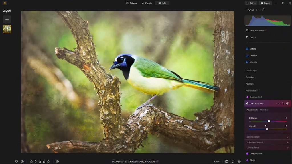
At the pinnacle of Color Harmony’s nuanced control lies Color Balance, a tool that grants independent mastery over the color tones residing within the shadows, midtones, and highlights of an image. This tripartite control system enables highly targeted adjustments, allowing photographers to precisely match or deliberately alter the atmospheric quality of a photograph. For instance, subtly shifting the midtones toward warmer hues can instantly transform a stark landscape into a more inviting vista, while nudging them cooler can imbue a portrait with a sense of calm neutrality or dramatic intensity. The power of Color Balance lies in its ability to address specific tonal ranges without globally affecting the entire image, thereby preserving the integrity of other areas.
This advanced capability makes Color Balance an indispensable tool for achieving consistent color grading across an entire series of photographs—a critical aspect for professional photographers working on client projects or curating a cohesive portfolio. Once mastered, it becomes a cornerstone for maintaining a signature look, ensuring that images from a single shoot, even if captured under varying conditions, share a unified aesthetic. The precision offered by Color Balance significantly contributes to the professional polish of an image, making it a foundational element for sophisticated color correction and creative grading strategies.
Guiding the Viewer’s Eye with Strategic Vignetting
Once the intricate color adjustments have been meticulously completed, a final, often subtle, touch can profoundly enhance the overall presentation: the application of a vignette. A vignette serves as a powerful compositional device, subtly drawing the viewer’s attention inward, directly toward the primary subject of the photograph. By strategically darkening the edges of the frame and, concurrently, introducing a delicate "Inner Light" in the center, the composition inherently pulls the eye towards the focal point. This creates a natural visual spotlight, intensifying focus without requiring heavy masking, complex local adjustments, or artificial-looking effects.
The art of effective vignetting lies in its restraint. When applied judiciously, it enhances the storytelling aspect of an image, framing the narrative and directing the viewer’s experience without overtly calling attention to itself. It acts as a quiet, yet remarkably potent, tool for strengthening composition and emotional impact, echoing techniques used by painters for centuries to control visual flow. The ability to fine-tune the size, shape, and intensity of the vignette, along with the degree of inner light, allows for a bespoke application that complements the specific dynamics of each photograph, making it a final, critical step in the post-processing workflow.
The Strategic Advantage of Presets in Workflow
In the demanding world of professional photography and content creation, efficiency and consistency are paramount. After painstakingly dialing in the perfect aesthetic for an image using Color Harmony and other tools, the ability to save these meticulous adjustments as a custom preset offers significant workflow advantages. This practice not only ensures a consistent editing style across an entire body of work but also provides a robust mechanism for revisiting and refining images at a later stage. Reapplying a saved preset to the same image—or indeed, to multiple images within the same series—establishes a quick and reliable baseline for future edits, drastically reducing repetitive tasks and freeing up creative time.
Moreover, the strategic use of presets provides an invaluable opportunity for critical self-assessment. It is a common professional practice to step away from an edit for a period, allowing for a fresh perspective. Upon returning, photographers often identify areas where an edit may have been overdone or where a more nuanced approach is required. With a saved preset, the original effect can be reapplied at a reduced strength (e.g., 70-80%), preserving the core aesthetic while softening any unintended excesses. This iterative refinement process, facilitated by intelligent preset management, is crucial for achieving a polished, professional outcome that withstands scrutiny.
A Finishing Touch That Defines Excellence
Ultimately, what truly distinguishes a compelling image from a merely competent one is rarely a single, dramatic alteration. Instead, it is a cumulative effect derived from a handful of carefully considered and expertly applied enhancements. Luminar Neo’s Color Harmony, when combined with subtle vignetting and a thoughtful, measured editing approach, delivers a powerful trifecta that injects depth, emotion, and visual cohesion into photographs. These tools move beyond basic corrections, enabling photographers to articulate their artistic vision with greater precision and impact.
For photographers seeking to impart a professional polish to their work without succumbing to the pitfalls of overprocessing, these sophisticated finishing tools within Luminar Neo offer an optimal balance of robust control and expansive creative freedom. They represent Skylum’s commitment to providing accessible, yet powerful, solutions that cater to the evolving needs of the global photographic community, helping to elevate visual storytelling to new heights. The ongoing development of such intuitive and effective features underscores a future where advanced photo editing is not just about technical correction, but about empowering every image to truly speak.