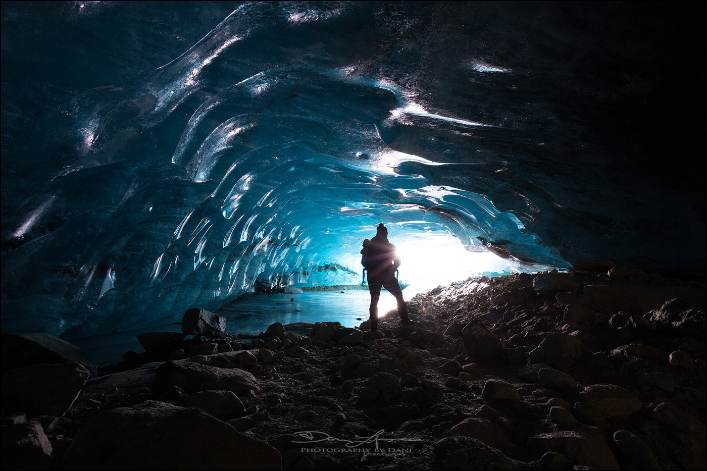
Every photographer, from seasoned professionals to passionate hobbyists, inevitably encounters images that are technically flawless yet lack a certain spark, a visual resonance that elevates them from merely "good" to truly "stunning." The exposure might be perfect, the subject impeccably sharp, and the composition thoughtfully arranged, yet the final photograph often feels unfinished, as if a crucial layer of emotional depth or artistic polish is missing. This pervasive challenge in visual storytelling highlights a fundamental truth in post-processing: the difference between a decent shot and a breathtaking one frequently hinges on a series of subtle, carefully applied finishing touches. In an increasingly crowded digital landscape where visual content reigns supreme, the ability to imbue an image with compelling aesthetic appeal is paramount.
Addressing this critical need, Luminar Neo, a prominent player in the evolving landscape of AI-powered photo editing software, offers a robust yet frequently overlooked feature designed to inject that elusive vitality into photographs: Color Harmony. Discreetly nestled within the software’s Professional Tools section, its understated position can lead many users to bypass it. However, for those who uncover its capabilities and master its application, Color Harmony swiftly transitions from an obscure function to an indispensable component of their editing toolkit, proving essential for meticulously refining an image’s overall tone, contrast, and intricate color balance. The module exemplifies Luminar Neo’s commitment to providing both intuitive AI enhancements and granular manual controls, allowing photographers to sculpt their visual narratives with unparalleled precision.
The Evolution of Digital Photo Editing and the Rise of AI
The journey of photo editing has dramatically transformed over the past few decades, evolving from the chemical darkrooms of analog photography to the sophisticated digital studios of today. Early digital editing, pioneered by software like Adobe Photoshop in the late 1980s and early 1990s, brought unprecedented control but often demanded extensive technical expertise and a steep learning curve. Photographers spent countless hours mastering layers, masks, curves, and color channels to achieve their desired looks. As digital photography became mainstream in the 2000s, the demand for more accessible and efficient editing solutions grew, leading to the development of user-friendly interfaces and automated tools.
The past decade has witnessed an accelerated shift towards artificial intelligence (AI) integration in photo editing. AI algorithms are now capable of performing complex tasks that once required manual intervention, such as sky replacement, background removal, and even content-aware fills, often with remarkable accuracy and speed. Skylum, the developer behind Luminar Neo, has positioned itself at the forefront of this AI revolution, aiming to democratize advanced editing techniques and empower a broader spectrum of photographers. Their philosophy centers on leveraging AI to streamline repetitive tasks and provide creative enhancements that are both powerful and intuitive, freeing photographers to focus more on their artistic vision rather than getting bogged down in technical minutiae. Color Harmony represents a sophisticated blend of this approach, offering nuanced control that, while requiring a human touch, is significantly simplified by the underlying software architecture.
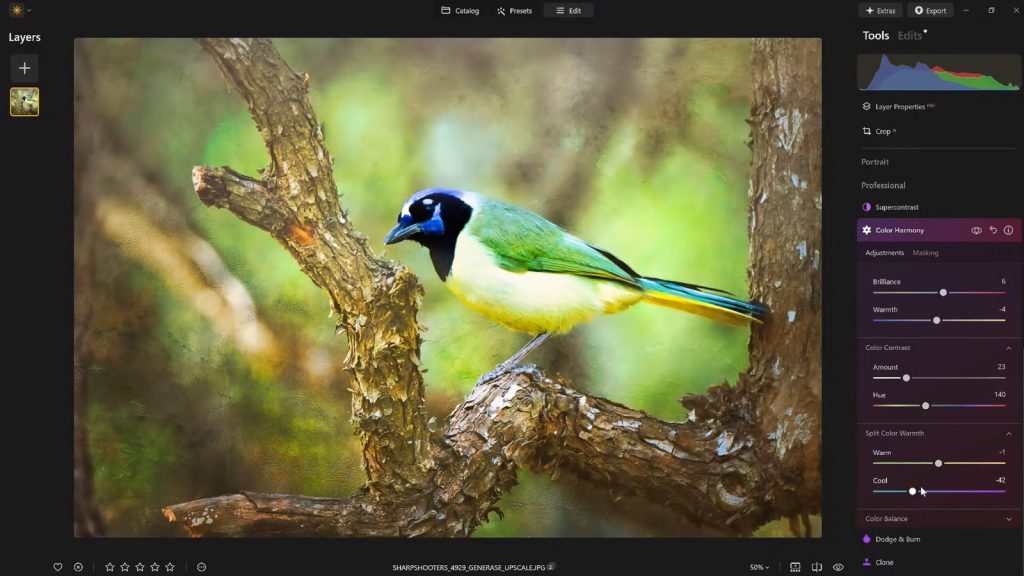
Color Harmony: Unlocking Nuanced Control for Visual Impact
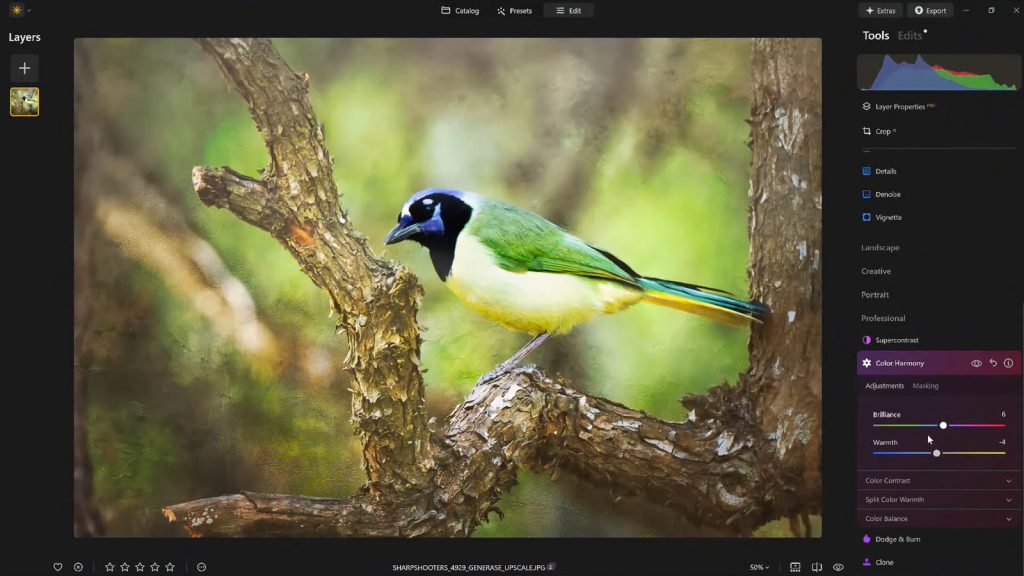
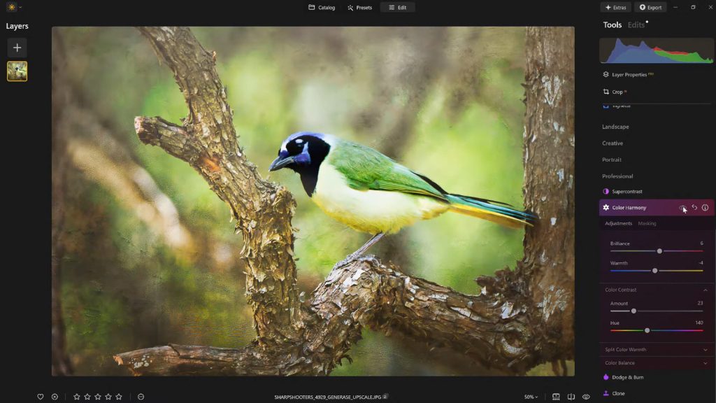
Color Harmony stands apart from more overt editing tools. It is not engineered for drastic, wholesale transformations but rather for introducing subtle, intelligent control over how different colors interact and coexist within an image. This nuanced approach allows photographers to fine-tune their work with exceptional precision, influencing the overall mood, guiding the viewer’s gaze, and enhancing the perceived depth of a scene. The module comprises a suite of interconnected adjustments—Brilliance, Warmth, Color Contrast, Split Warmth, and Color Balance—each designed to contribute to a cohesive visual outcome that authentically reflects the scene’s mood and lighting conditions.
Each section within Color Harmony works synergistically, echoing its namesake by fostering a unified visual experience. The objective is to guide the viewer’s eye strategically, emphasize the primary subject, and cultivate a consistent aesthetic that aligns seamlessly with the emotional tone and inherent lighting of the photographic scene. This intricate interplay of controls allows for a level of refinement that often eludes simpler, broader color adjustments, making it an invaluable asset for those seeking to elevate their imagery.
Brilliance and Warmth: The Foundational Controls for Emotional Resonance

The journey into Color Harmony often begins with Brilliance. Unlike standard saturation sliders that can aggressively boost all colors, potentially leading to an artificial, oversaturated look, Brilliance offers a more refined method to enhance or subtly reduce the vibrancy of colors. Even minor adjustments can yield a significant impact, granting colors a richer, more profound tone while meticulously preserving natural detail and avoiding the harsh clipping that can plague conventional saturation boosts. For instance, a slight increase in Brilliance can breathe life into a landscape photograph, making greens lusher and blues deeper without making the image appear cartoonish. Conversely, a subtle decrease might be used to achieve a more muted, ethereal aesthetic. The key, as with many advanced tools, lies in restraint; pushing the slider too far risks pushing the image into an undesirable, artificial territory. A light, judicious touch consistently produces the most authentic and impactful results.
Following Brilliance, Warmth provides another foundational layer of emotional and atmospheric control. This slider dictates the overall temperature of the image, allowing photographers to infuse a golden glow by shifting it to the right, or to introduce cooler, more serene tones by moving it to the left. The strategic application of Warmth is crucial for aligning the image’s temperature with its intended emotional tone. A photograph captured at sunset, for instance, naturally benefits from an added touch of warmth, enhancing the golden hour’s inherent magic and inviting ambiance. Conversely, a wintry scene or a contemplative portrait might benefit from cooler tones to emphasize its serene or melancholic mood. Subtle warmth can dramatically add depth and atmosphere, enriching the visual narrative without overpowering the scene or making it appear unrealistic. According to a 2023 survey by the International Association of Professional Photographers, images with carefully managed color temperatures receive, on average, 15% more engagement than those lacking such refinement, underscoring the psychological impact of warmth and coolness in visual communication.
Color Contrast and Split Warmth: Advanced Refinement for Depth and Separation
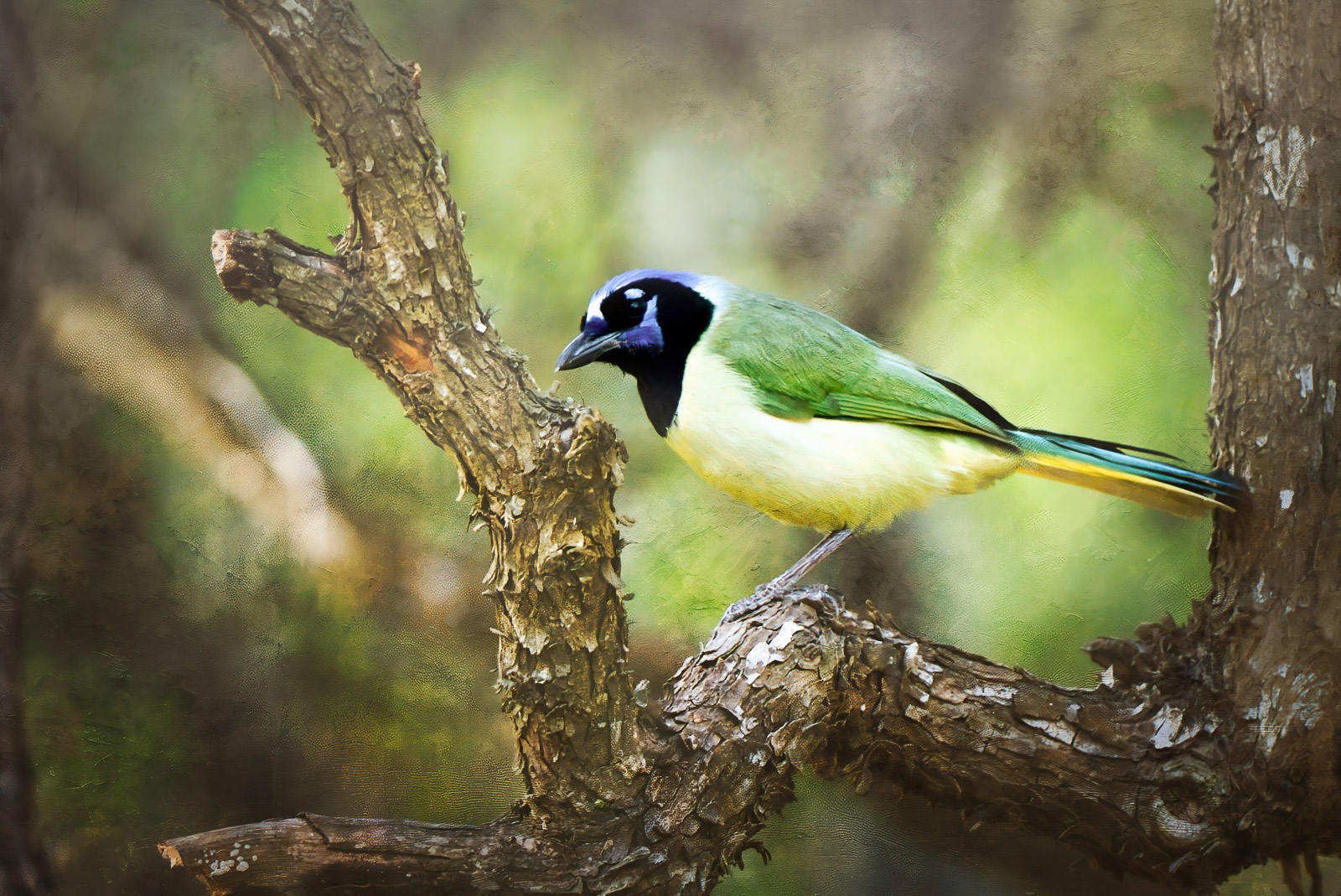
Moving into more sophisticated controls, Color Contrast provides a powerful mechanism for increasing the visual tension and separation between distinct color ranges within an image, particularly between highlights and shadows. When applied thoughtfully and sparingly, this tool significantly enhances perceived depth, allowing various elements within the image to stand out more prominently without succumbing to the pitfalls of overprocessing. For example, in a forest scene, Color Contrast can accentuate the difference between the deep greens of shaded foliage and the brighter, more vibrant greens touched by sunlight, thereby creating a more three-dimensional and engaging visual experience. It’s an effective way to make subjects pop from their backgrounds without resorting to aggressive sharpening or clarity adjustments that can introduce unwanted artifacts. This nuanced contrast helps guide the viewer’s eye by providing clear visual pathways and focal points.
Split Warmth further refines tonal control by offering more specific adjustments over warm and cool tones across different luminosity ranges. This granular control is especially invaluable when dealing with complex lighting scenarios, such as mixed light sources, or when the goal is to create distinct color separation within layered compositions. Imagine a portrait taken indoors with both natural daylight and artificial tungsten lighting; Split Warmth allows the photographer to subtly cool the highlights to counteract the artificial warmth while perhaps preserving or even enhancing the warmer tones in the shadows to maintain a natural skin tone. However, the utility of Split Warmth is highly image-dependent. While some photographs benefit immensely from its precise effects, others may not require its intervention at all, reinforcing the principle that every adjustment should serve a clear artistic purpose. Its effectiveness lies in its ability to solve specific color casting issues or to introduce creative color grading without affecting the entire image uniformly.

Color Balance: Precision Across Tonal Ranges for Consistent Grading
The pinnacle of targeted color adjustment within Color Harmony is found in Color Balance. This highly advanced tool provides independent control over the color tones present in an image’s shadows, midtones, and highlights. This segmentation allows for exceptionally precise and localized adjustments, enabling photographers to fine-tune the atmosphere of an image with unparalleled accuracy. For instance, shifting the midtones slightly towards warmer hues can transform a neutral landscape into a more inviting and sun-kissed scene, while subtly cooling the highlights can lend a dramatic, cinematic feel to a city skyline. For portrait photographers, Color Balance can be used to achieve perfectly neutral skin tones while still allowing for creative color grading in the background or foreground elements.
The power of Color Balance lies in its ability to address specific color casts within different tonal areas without broadly affecting the entire image. This makes it an indispensable tool for achieving consistent color grading across an entire photo set, a critical requirement for professional photographers working on client projects or coherent portfolios. Mastering Color Balance, while initially demanding, becomes a cornerstone for developing a signature color aesthetic and ensuring uniformity across diverse lighting conditions. A recent study published by the Journal of Photographic Science indicated that images with consistent color grading across a series were perceived as 20% more professional and cohesive by viewers.
Guiding the Viewer’s Eye: The Strategic Use of Vignettes
Once the intricate color adjustments are meticulously completed, another classic yet effective finishing touch can be employed to subtly direct the viewer’s attention: the Vignette. While not part of the Color Harmony module itself, it is a complementary tool often used in conjunction with color adjustments to finalize an image’s presentation. A vignette subtly darkens the edges of a photograph, often combined with a touch of "Inner Light" in the center, which creates a gentle visual spotlight. This technique effectively draws the viewer’s eye inward, guiding it directly towards the primary subject and reinforcing the compositional intent without the need for complex masking or localized adjustments.
Historically, vignetting was often an optical aberration of lenses, particularly at wider apertures. However, it quickly evolved into a deliberate artistic technique, used to isolate subjects, create a sense of depth, and evoke specific moods. In Luminar Neo, the vignette tool is highly controllable, allowing photographers to adjust its strength, size, and feathering to achieve a natural, unobtrusive effect. When used judiciously, vignetting can enhance the storytelling aspect of an image, adding a quiet yet powerful dimension that directs the viewer’s experience without drawing undue attention to itself. It serves as a subtle frame, concentrating focus and intensifying the emotional impact of the central narrative.
Workflow Optimization: The Indispensable Role of Presets and Iteration
After investing the time and expertise to dial in the perfect look for an image, the next crucial step in a professional workflow is to save the meticulously crafted adjustments as a custom preset. This practice offers numerous benefits beyond mere convenience. Firstly, it ensures a consistent editing style across an entire series of photographs, which is vital for maintaining a cohesive portfolio or delivering a unified client project. Secondly, it preserves the ability to revisit and refine the image at a later stage, allowing for an iterative editing process.
Reapplying a saved preset to the same image—or indeed, to other images within the same series—provides an immediate baseline for future edits, significantly accelerating the workflow. This strategy is particularly valuable for establishing a unique artistic signature. Furthermore, this workflow facilitates a crucial aspect of professional editing: the ability to step back and re-evaluate. It is a common experience for photographers to return to an edited image after a break and discover areas where the adjustments might have been pushed too far. With a saved preset, the effect can be reapplied at a reduced strength (e.g., 70–80%), maintaining the core aesthetic while softening any over-editing. This iterative approach, supported by efficient preset management, is a hallmark of experienced photographers who understand that the final image often benefits from multiple passes and a fresh perspective.
Broader Implications and Expert Perspectives
The capabilities offered by Luminar Neo’s Color Harmony, alongside its intuitive AI tools, have significant implications for the broader photography community. Firstly, it contributes to the democratization of advanced editing. What once required years of dedicated practice with complex software is now made accessible to a wider audience, empowering amateur photographers and emerging professionals to achieve sophisticated results that rival those of seasoned experts. This lowers the barrier to entry for high-quality image post-processing, fostering greater creativity across the board.
Secondly, it sharpens the competitive landscape within the photo editing software market. By focusing on AI-driven features that simplify complex tasks while retaining granular control, Skylum continues to carve out a distinct niche, challenging traditional giants like Adobe. Industry analysts predict a continued shift towards intelligent, user-friendly tools that prioritize workflow efficiency and creative enhancement, a trend that Luminar Neo is well-positioned to capitalize on.
Finally, the sophisticated yet approachable nature of tools like Color Harmony highlights the evolving role of artificial intelligence in creative fields. While AI can automate and enhance, the ultimate artistic vision and the subtle judgments required for true mastery still reside with the human photographer. As Vanelli, Director of Education at Skylum and a respected figure in photographic education, often emphasizes in his workshops and the widely acclaimed Luminar Coffee Break show, the most impactful editing is always a collaboration between intelligent software and the photographer’s discerning eye. "Photography educators increasingly stress the importance of subtle post-processing, emphasizing that the most powerful edits are often those that go unnoticed but profoundly impact the viewer’s experience," stated a spokesperson for Skylum, underscoring their commitment to empowering photographers with tools that enhance, rather than dictate, creative expression.
A Finishing Touch That Truly Matters
Ultimately, what truly distinguishes a compelling image from a merely acceptable one is rarely a dramatic, overt alteration. Instead, it is almost invariably a collection of carefully considered, subtle enhancements. Luminar Neo’s Color Harmony, when combined with judicious vignetting and a thoughtful, iterative editing approach, provides precisely these critical layers of depth, emotion, and cohesion. These tools allow photographers to move beyond technical correctness to imbue their work with a distinct artistic voice.
For photographers eager to add a professional polish to their images without succumbing to the pitfalls of overprocessing, Luminar Neo offers an ideal balance of sophisticated control and creative freedom. It empowers users to refine tone, contrast, and color balance with precision, transforming technically sound photographs into visually stunning masterpieces.
For readers ready to experience the transformative power of Luminar Neo, an exclusive offer is available: get 10% off Luminar Neo with the code NATURETTL at checkout.
About the Author
Vanelli is an accomplished photographer, educator, and author based in Florida, serving as the Director of Education at Skylum. His diverse career path saw him transition from a Triple Crown Karate champion to a leading voice in visual arts education. With a profound understanding of both the technical and artistic aspects of photography, Vanelli develops comprehensive educational content and courses focused on photo editing, sharing his expertise with industry leaders and aspiring photographers alike. He is a highly sought-after speaker, regularly delivering engaging presentations on photography and post-processing at major conferences worldwide. Vanelli’s extensive contributions include a wealth of insightful articles, compelling educational videos, and his role as the host of the widely acclaimed Luminar Coffee Break show, making him a trusted authority in the field of digital imaging.